 |
The upper-case 'Q' tail crosses the circle.
|
 |
The '&' (ampersand) is traditional style with a gap at the top.
|
 |
The diagonal strokes of the upper-case 'K' connect to the vertical via a horizontal bar.
|
 |
The dot on the '?' (question-mark) is square or rectangular.
|
 |
The leg of the upper-case 'R' is curved outwards.
|
 |
The dot on the lower-case 'i' or 'j' is square or rectangular.
|
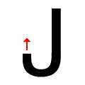 |
The tail of the upper-case 'J' points vertically.
|
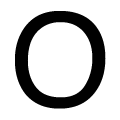 |
The upper-case letter 'O' is taller than it is wide.
|
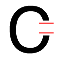 |
The ends of the upper-case 'C' stroke are horizontal or nearly horizontal.
|
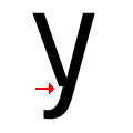 |
There is a break at the junction of the lower-case 'y'.
|
There are more than ten differences; only the first ten are shown.
Note that the fonts in the icons shown above represent general examples, not necessarily the two fonts chosen for comparison.
Show Examples
 |
The upper-case 'Q' tail touches the circle.
|
 |
The '&' (ampersand) is traditional style with two enclosed loops.
|
 |
The diagonal strokes of the upper-case 'K' meet at the vertical (with or without a gap).
|
 |
The dot on the '?' (question-mark) is circular or oval.
|
 |
The leg of the upper-case 'R' is straight.
|
 |
The dot on the lower-case 'i' or 'j' is circular or oval.
|
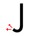 |
The tail of the upper-case 'J' points horizontally or slightly upwards.
|
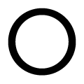 |
The upper-case letter 'O' is circular or equal proportions.
|
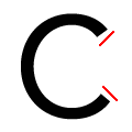 |
The ends of the upper-case 'C' stroke are angled.
|
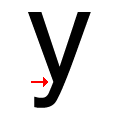 |
There is a smooth join at the junction of the lower-case 'y'.
|