Differences
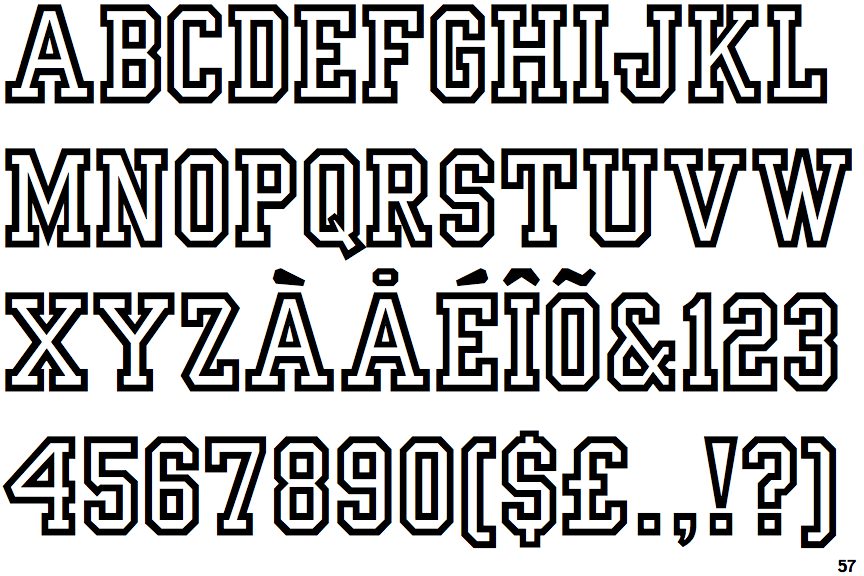
Yearbook Outline
 |
The upper-case 'Q' tail crosses the circle.
|
 |
The '&' (ampersand) is traditional style with a gap at the top.
|
 |
The characters have serifs.
|
 |
The diagonal strokes of the upper-case 'K' meet in a 'T'.
|
 |
The centre vertex of the upper-case 'M' is on the baseline.
|
Note that the fonts in the icons shown above represent general examples, not necessarily the two fonts chosen for comparison.
Show ExamplesGrand Canyon Whitewater
 |
The upper-case 'Q' tail is below and separated from the circle.
|
 |
The '&' (ampersand) is traditional style with two enclosed loops.
|
 |
The characters do not have serifs.
|
 |
The diagonal strokes of the upper-case 'K' meet at the vertical (with or without a gap).
|
 |
The centre vertex of the upper-case 'M' is above the baseline.
|

