 |
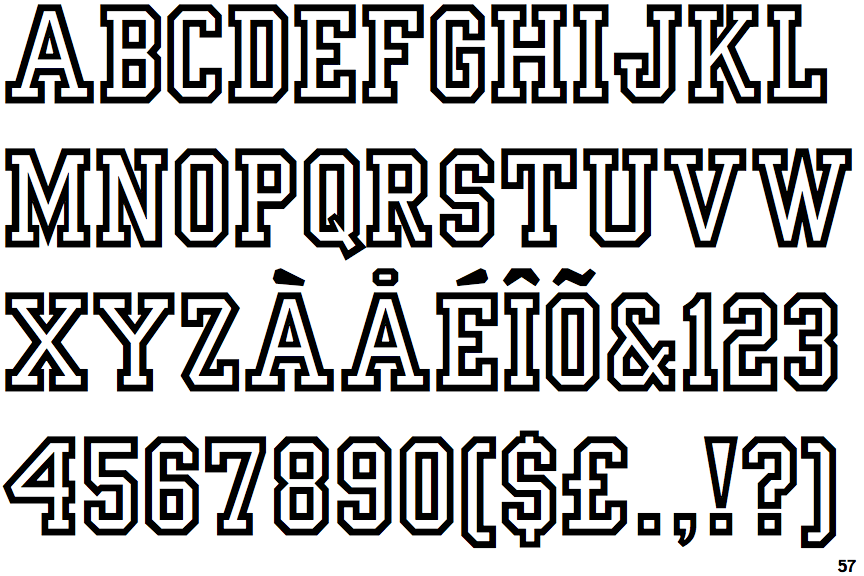
The '$' (dollar) has a single line which does not cross the 'S'.
|
 |
The '&' (ampersand) is traditional style with a gap at the top.
|
 |
The dot on the '?' (question-mark) is square or rectangular.
|
 |
The verticals of the upper-case 'M' are parallel.
|
 |
The centre bar of the upper-case 'P' meets the vertical.
|
 |
The centre bar of the upper-case 'E' has no serifs.
|
 |
The tail of the upper-case 'Q' is straight.
|
 |
The bar of the upper-case 'G' is single-sided, left-facing.
|
 |
The centre bar of the upper-case 'F' has no serifs.
|
 |
The characters are outlined.
|
Note that the fonts in the icons shown above represent general examples, not necessarily the two fonts chosen for comparison.
Show Examples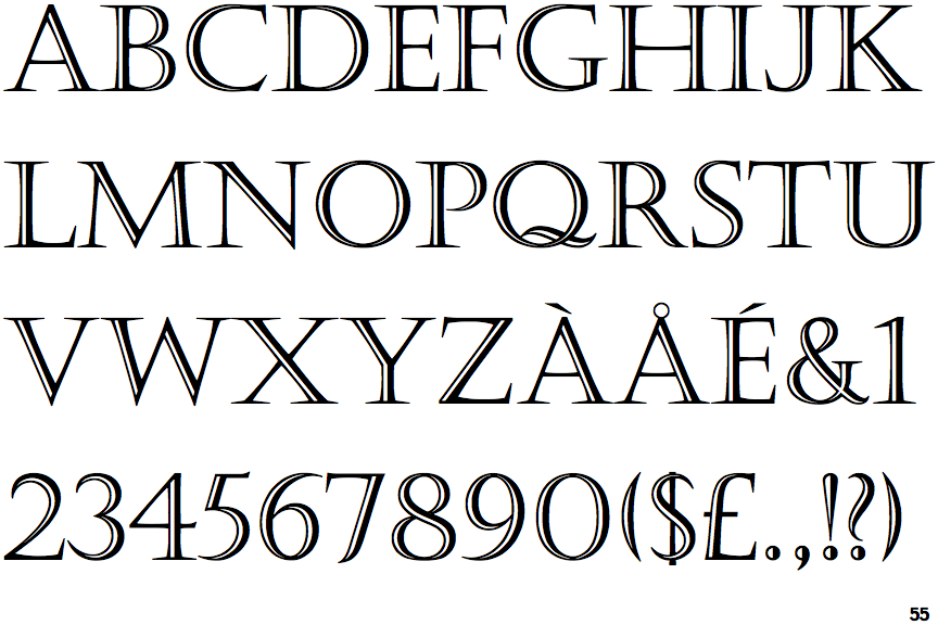
 |
The '$' (dollar) has a single line crossing the 'S'.
|
 |
The '&' (ampersand) is traditional style with two enclosed loops.
|
 |
The dot on the '?' (question-mark) is circular or oval.
|
 |
The verticals of the upper-case 'M' are sloping.
|
 |
The centre bar of the upper-case 'P' leaves a gap with the vertical.
|
 |
The centre bar of the upper-case 'E' has serifs.
|
 |
The tail of the upper-case 'Q' is curved or S-shaped.
|
 |
The bar of the upper-case 'G' is double-sided.
|
 |
The centre bar of the upper-case 'F' has serifs.
|
 |
The characters are outlined with thick and thin lines to give a 3D appearance (open face, engraved, or handtooled).
|