 |
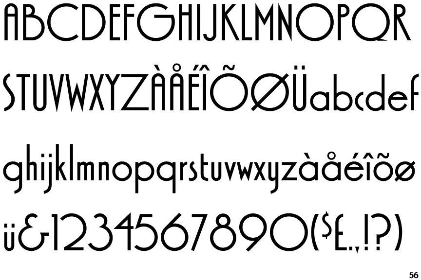
The '&' (ampersand) looks like 'Et' with a gap at the top.
|
 |
The characters do not have serifs.
|
 |
The diagonal strokes of the upper-case 'K' meet at the vertical (with or without a gap).
|
 |
The dot on the '?' (question-mark) is square or rectangular.
|
 |
The lower-case 'a' stem stops at the top of the bowl (single storey).
|
 |
The upper-case 'A' has parallel verticals.
|
 |
The centre bar of the upper-case 'R' meets the vertical.
|
 |
The sides of the lower-case 'y' are parallel (U-shaped).
|
 |
The dot on the lower-case 'i' or 'j' is square or rectangular.
|
 |
The bar of the lower-case 'f' is single-sided.
|
Note that the fonts in the icons shown above represent general examples, not necessarily the two fonts chosen for comparison.
Show Examples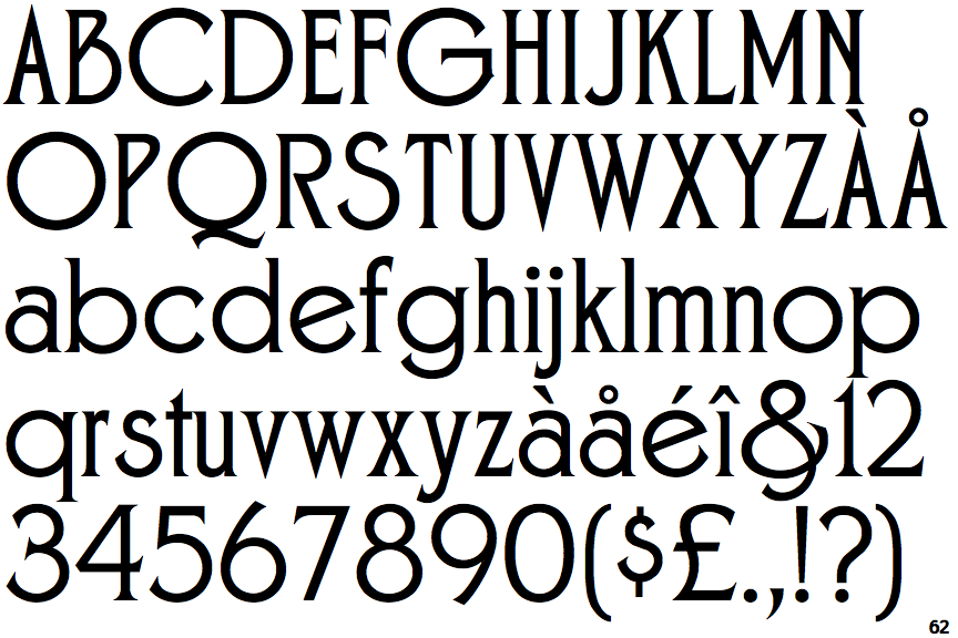
 |
The '&' (ampersand) is traditional style with two enclosed loops.
|
 |
The characters have serifs.
|
 |
The diagonal strokes of the upper-case 'K' meet in a 'T'.
|
 |
The dot on the '?' (question-mark) is circular or oval.
|
 |
The lower-case 'a' stem curves over the top of the bowl (double storey).
|
 |
The upper-case 'A' has tapered verticals.
|
 |
The centre bar of the upper-case 'R' leaves a gap with the vertical.
|
 |
The sides of the lower-case 'y' are angled (V-shaped).
|
 |
The dot on the lower-case 'i' or 'j' is circular or oval.
|
 |
The bar of the lower-case 'f' is double-sided.
|