Identifont

Fonts by Appearance

Fonts by Name

Fonts by Similarity

Fonts by Picture

Fonts by Designer/Publisher

Differences

TweetTweet Differences

Compare: and  

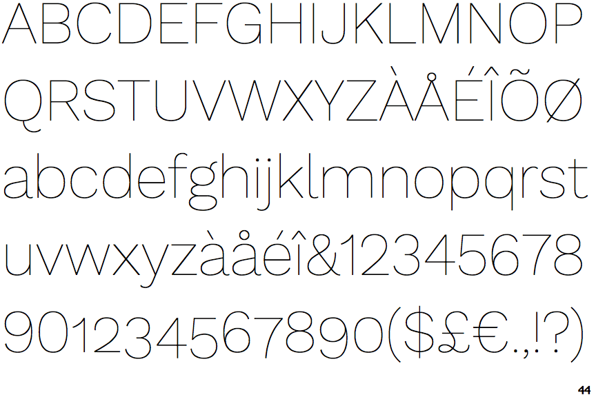
Work Sans Thin

Work Sans Thin

2-Storey
The lower-case 'g' is double-storey (with or without gap).
Right
The 'l' (lower-case 'L') has a right-facing lower serif or tail.
Straight
The leg of the upper-case 'R' is straight.

Note that the fonts in the icons shown above represent general examples, not necessarily the two fonts chosen for comparison.

Show Examples
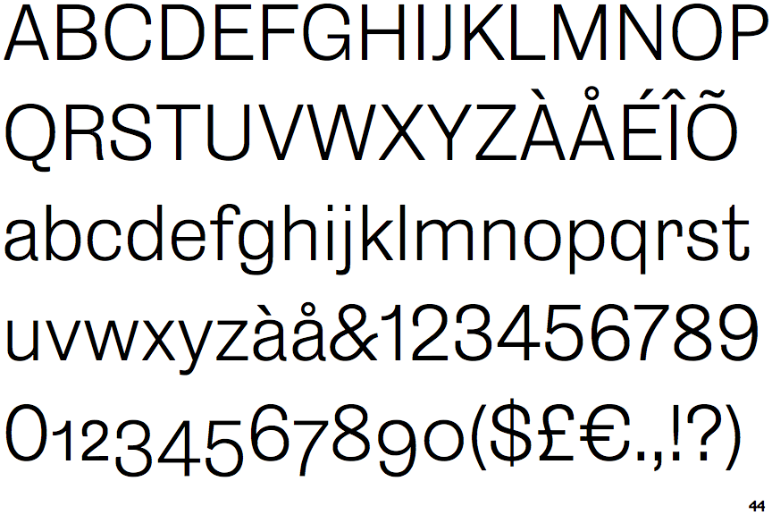
Salmanazar Light

Salmanazar Light

1-Storey
The lower-case 'g' is single-storey (with or without loop).
Plain
The 'l' (lower-case 'L') has no serifs or tail.
Outwards
The leg of the upper-case 'R' is curved outwards.