 |
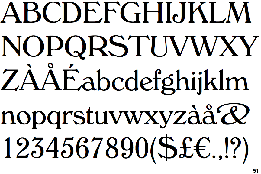
The '&' (ampersand) is traditional style with two enclosed loops.
|
 |
The upper-case 'J' sits on the baseline.
|
 |
The top storey of the '3' is a sharp angle.
|
 |
The top stroke of the upper-case 'C' has a vertical or angled upward-pointing serif.
|
 |
The lower-case 'e' has a straight angled bar.
|
 |
The stroke of the lower-case 'c' has a flat end or downward-pointing serif.
|
 |
The top vertices of the upper-case 'M' have symmetrical double-sided serifs.
|
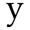 |
The tail of the lower-case 'y' is curved with a flat end or cusp.
|
 |
The foot of the '£' (pound) has a loop.
|
 |
The foot of the upper-case 'R' sits on the baseline.
|
Note that the fonts in the icons shown above represent general examples, not necessarily the two fonts chosen for comparison.
Show Examples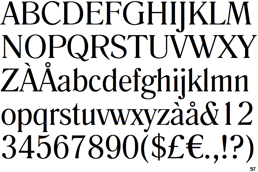
 |
The '&' (ampersand) is traditional style with a gap at the top.
|
 |
The upper-case 'J' descends below the baseline.
|
 |
The top storey of the '3' is a smooth curve.
|
 |
The top stroke of the upper-case 'C' has no upward-pointing serif.
|
 |
The lower-case 'e' has a straight horizontal bar.
|
 |
The stroke of the lower-case 'c' has a rounded end or ball.
|
 |
The top vertices of the upper-case 'M' have symmetrical single-sided serifs.
|
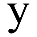 |
The tail of the lower-case 'y' is curved with a rounded end or ball.
|
 |
The foot of the '£' (pound) has no loop.
|
 |
The foot of the upper-case 'R' descends below the baseline.
|