Differences
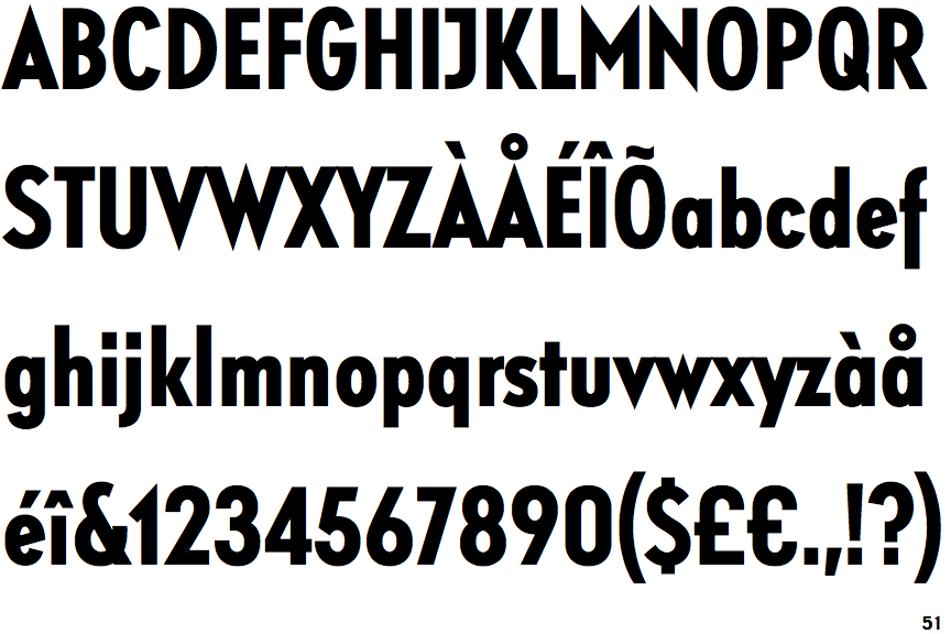
Windlesham Condensed Bold
 |
The '$' (dollar) has a single line which does not cross the 'S'.
|
 |
The '&' (ampersand) is traditional style with a gap at the top.
|
 |
The diagonal strokes of the upper-case 'K' meet at the vertical (with or without a gap).
|
 |
The centre vertex of the upper-case 'M' is above the baseline.
|
 |
The lower-case 'a' stem stops at the top of the bowl (single storey).
|
 |
The upper-case 'G' has no spur/tail.
|
 |
The upper-case 'J' has a bar to the left.
|
 |
The lower-case 'e' has a straight angled bar.
|
 |
The tail of the lower-case 'y' is substantially straight.
|
 |
The lower-case 'u' has no stem/serif.
|
There are more than ten differences; only the first ten are shown.
Note that the fonts in the icons shown above represent general examples, not necessarily the two fonts chosen for comparison.
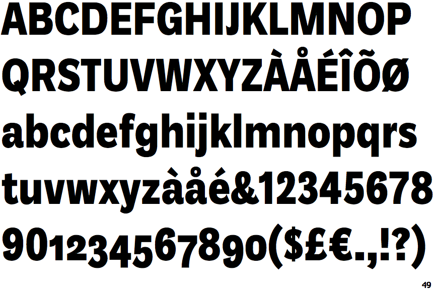
Show ExamplesPlan Grotesque Condensed Bold
 |
The '$' (dollar) has a single line crossing the 'S'.
|
 |
The '&' (ampersand) is traditional style with two enclosed loops.
|
 |
The diagonal strokes of the upper-case 'K' meet in a 'T'.
|
 |
The centre vertex of the upper-case 'M' is on the baseline.
|
 |
The lower-case 'a' stem curves over the top of the bowl (double storey).
|
 |
The upper-case 'G' has a spur/tail.
|
 |
The upper-case 'J' has no bar.
|
 |
The lower-case 'e' has a straight horizontal bar.
|
 |
The tail of the lower-case 'y' is curved or U-shaped to the left.
|
 |
The lower-case 'u' has a stem/serif.
|

