 |
The upper-case 'Q' tail crosses the circle.
|
 |
The '&' (ampersand) is traditional style with a gap at the top.
|
 |
The diagonal strokes of the upper-case 'K' meet at the vertical (with or without a gap).
|
 |
The lower-case 'a' stem stops at the top of the bowl (single storey).
|
 |
The upper-case 'J' has a bar to the left.
|
 |
The lower-case 'e' has a straight angled bar.
|
 |
The lower-case 'u' has no stem/serif.
|
 |
The tail of the lower-case 'f' descends below the baseline.
|
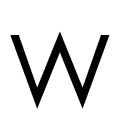 |
The upper-case 'W' vertices are pointed at the top and bottom.
|
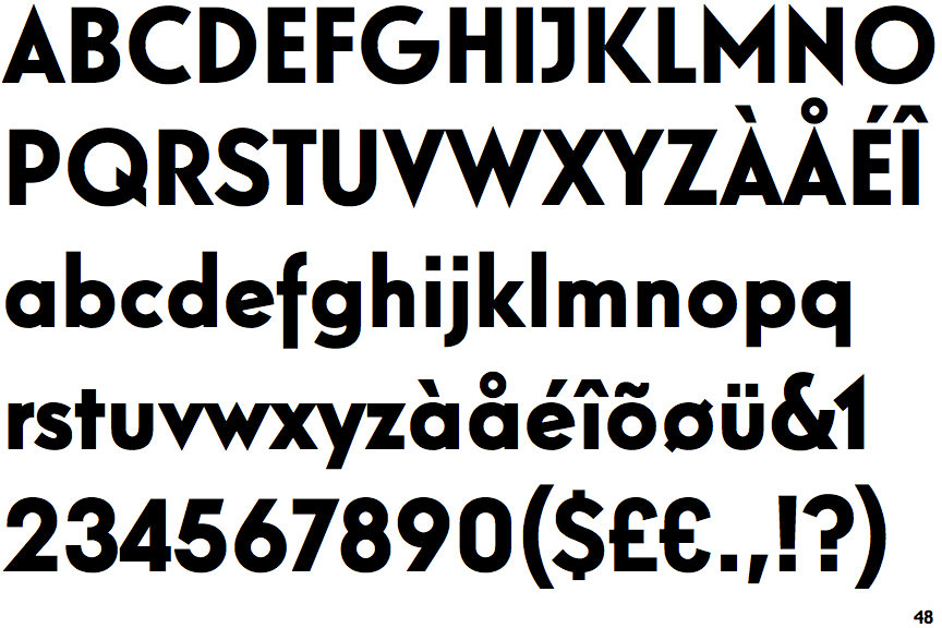
Note that the fonts in the icons shown above represent general examples, not necessarily the two fonts chosen for comparison.
Show Examples
 |
The upper-case 'Q' tail touches the circle.
|
 |
The '&' (ampersand) is traditional style with two enclosed loops.
|
 |
The diagonal strokes of the upper-case 'K' meet in a 'T'.
|
 |
The lower-case 'a' stem curves over the top of the bowl (double storey).
|
 |
The upper-case 'J' has no bar.
|
 |
The lower-case 'e' has a straight horizontal bar.
|
 |
The lower-case 'u' has a stem/serif.
|
 |
The tail of the lower-case 'f' sits on the baseline.
|
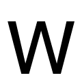 |
The upper-case 'W' vertices are flat at the top and bottom.
|