 |
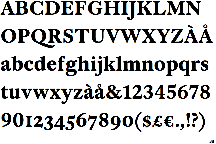
The upper-case 'J' descends below the baseline.
|
 |
The leg of the upper-case 'K' has two serifs.
|
 |
The upper-case 'W' centre strokes meet at or near the top of the letter.
|
Note that the fonts in the icons shown above represent general examples, not necessarily the two fonts chosen for comparison.
Show Examples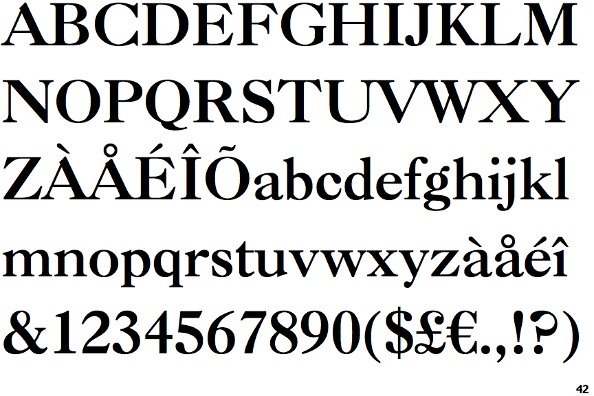
 |
The upper-case 'J' sits on the baseline.
|
 |
The leg of the upper-case 'K' has a single right-pointing serif or foot.
|
 |
The upper-case 'W' centre strokes meet below the top of the letter, with separate serifs.
|