Identifont

Fonts by Appearance

Fonts by Name

Fonts by Similarity

Fonts by Picture

Fonts by Designer/Publisher

Differences

TweetTweet Differences

Compare: and  

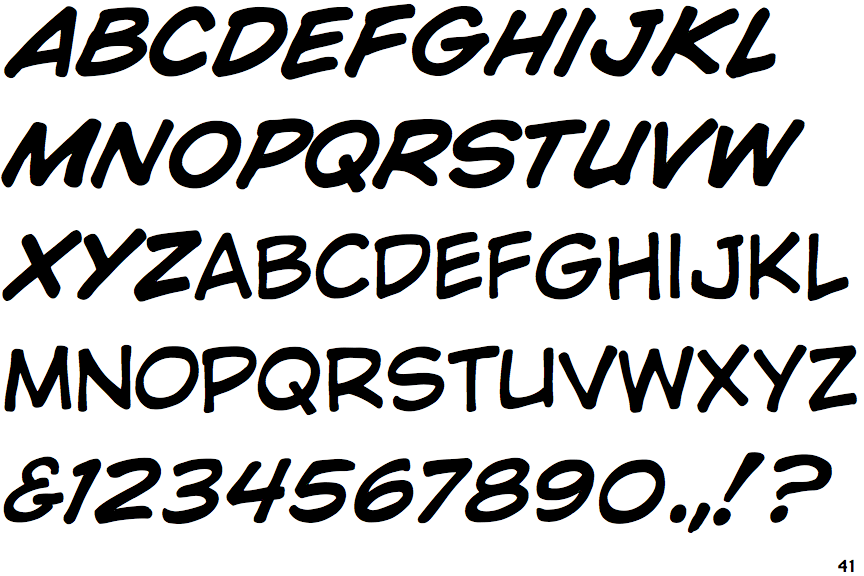
Wild and Crazy

Wild and Crazy

Gap top
The '&' (ampersand) looks like 'Et' with a gap at the top.
Open
The '4' is open.
Stem
The upper-case 'U' has a stem/serif.
Plain
The upper-case letter 'I' is plain.
Stroke
The upper-case 'I' is a single stroke with no serifs.

Note that the fonts in the icons shown above represent general examples, not necessarily the two fonts chosen for comparison.

Show Examples
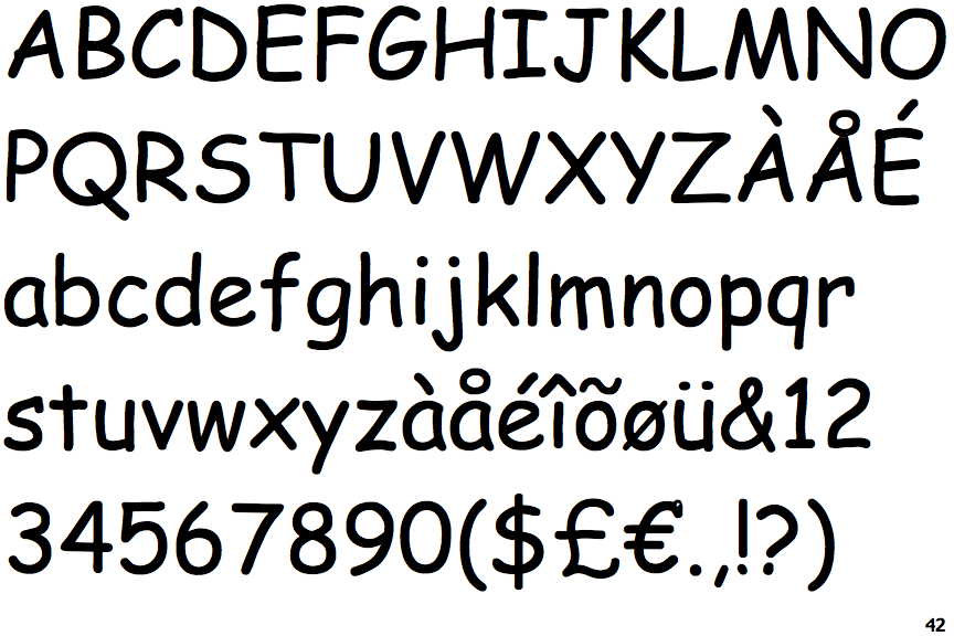
Comic Sans

Comic Sans

Closed
The '&' (ampersand) is traditional style with two enclosed loops.
Closed
The '4' is closed.
No-Stem
The upper-case 'U' has no stem/serif.
Serifs
The upper-case letter 'I' has serifs/bars.
Serifs
The upper-case 'I' is a single stroke with serifs.