Identifont

Fonts by Appearance

Fonts by Name

Fonts by Similarity

Fonts by Picture

Fonts by Designer/Publisher

Differences

TweetTweet Differences

Compare: and  

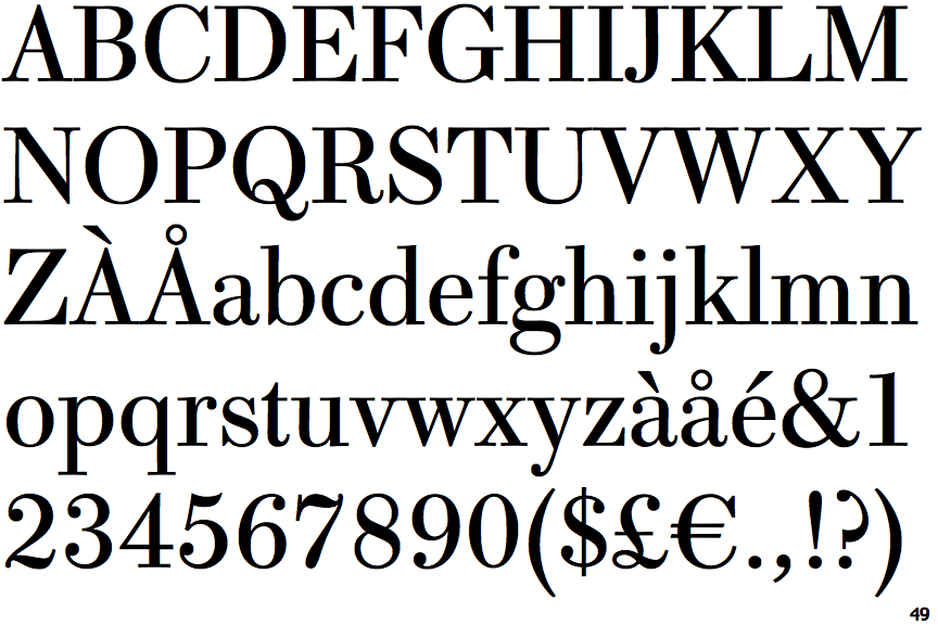
Whittingham

Whittingham

Crosses
The upper-case 'Q' tail crosses the circle.
Double
The diagonal strokes of the upper-case 'K' meet in a 'T'.
Round
The top storey of the '3' is a smooth curve.
Top serif
The top stroke of the upper-case 'C' has a vertical or angled upward-pointing serif.
Spur
The upper-case 'G' foot has a downward pointing spur.

Note that the fonts in the icons shown above represent general examples, not necessarily the two fonts chosen for comparison.

Show Examples
Walburn

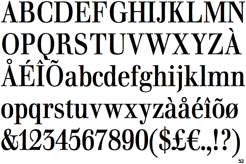
Walburn

Touches
The upper-case 'Q' tail touches the circle.
Bar
The diagonal strokes of the upper-case 'K' connect to the vertical via a horizontal bar.
Angled
The top storey of the '3' is a sharp angle.
No top serif
The top stroke of the upper-case 'C' has no upward-pointing serif.
No-Spur
The upper-case 'G' foot has no spur or serif.