Identifont

Fonts by Appearance

Fonts by Name

Fonts by Similarity

Fonts by Picture

Fonts by Designer/Publisher

Differences

TweetTweet Differences

Compare: and  

Whitman

Whitman

Sloping
The verticals of the upper-case 'M' are sloping.
Meets
The centre bar of the upper-case 'P' meets the vertical.
Top serif
The top stroke of the upper-case 'C' has a vertical or angled upward-pointing serif.

Note that the fonts in the icons shown above represent general examples, not necessarily the two fonts chosen for comparison.

Show Examples
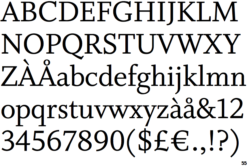
Tempera Biblio A

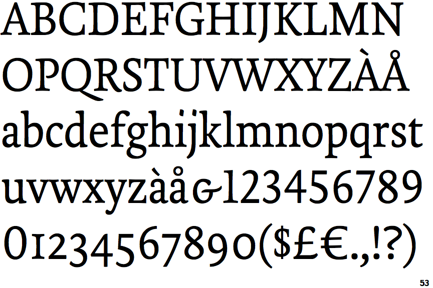
Tempera Biblio A

Parallel
The verticals of the upper-case 'M' are parallel.
Gap
The centre bar of the upper-case 'P' leaves a gap with the vertical.
No top serif
The top stroke of the upper-case 'C' has no upward-pointing serif.