 |
The centre vertex of the upper-case 'M' is on the baseline.
|
 |
The dot on the '?' (question-mark) is circular or oval.
|
 |
The verticals of the upper-case 'M' are sloping.
|
 |
The top stroke of the upper-case 'C' has a vertical or angled upward-pointing serif.
|
 |
The upper-case 'G' foot has no spur or serif.
|
 |
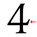
The foot of the '4' has no serifs.
|
 |
The dot on the lower-case 'i' or 'j' is circular or oval.
|
 |
The centre vertex of the upper-case 'W' has two separate serifs.
|
 |
The bar of the '4' has no serifs or spur.
|
 |
The centre vertex of the lower-case 'w' has distinct centre serifs.
|
Note that the fonts in the icons shown above represent general examples, not necessarily the two fonts chosen for comparison.
Show Examples
 |
The centre vertex of the upper-case 'M' is above the baseline.
|
 |
The dot on the '?' (question-mark) is square or rectangular.
|
|
The verticals of the upper-case 'M' are parallel.
|
 |
The top stroke of the upper-case 'C' has no upward-pointing serif.
|
 |
The upper-case 'G' foot has a downward pointing spur.
|
 |
The foot of the '4' has double-sided serifs.
|
 |
The dot on the lower-case 'i' or 'j' is square or rectangular.
|
 |
The centre vertex of the upper-case 'W' has no serifs.
|
 |
The bar of the '4' has a single spur.
|
 |
The centre vertex of the lower-case 'w' has no centre serifs.
|