Differences
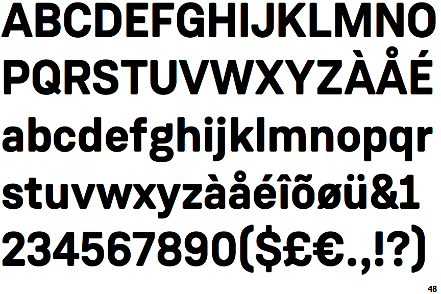
Weissenhof Grotesk Bold
 |
The upper-case 'Q' tail crosses the circle.
|
 |
The '$' (dollar) has a single line which does not cross the 'S'.
|
 |
The '&' (ampersand) is traditional style with two enclosed loops.
|
 |
The diagonal strokes of the upper-case 'K' meet in a 'T'.
|
 |
The dot on the '?' (question-mark) is circular or oval.
|
 |
The lower-case 'g' is double-storey (with or without gap).
|
 |
The upper-case 'G' has a spur/tail.
|
 |
The leg of the upper-case 'R' is straight.
|
 |
The dot on the lower-case 'i' or 'j' is circular or oval.
|
 |
The tail of the lower-case 'y' is curved or U-shaped to the left.
|
There are more than ten differences; only the first ten are shown.
Note that the fonts in the icons shown above represent general examples, not necessarily the two fonts chosen for comparison.
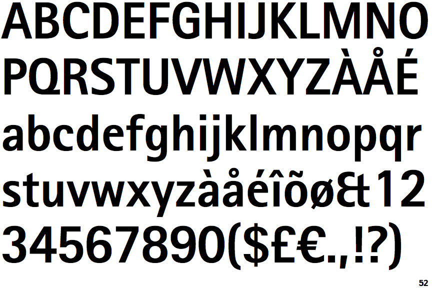
Show ExamplesRotis II Sans Pro Bold
 |
The upper-case 'Q' tail touches the circle.
|
 |
The '$' (dollar) has a single line crossing the 'S'.
|
 |
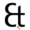
The '&' (ampersand) looks like 'Et' with a gap at the bottom (with or without exit stroke).
|
 |
The diagonal strokes of the upper-case 'K' meet at the vertical (with or without a gap).
|
 |
The dot on the '?' (question-mark) is square or rectangular.
|
 |
The lower-case 'g' is single-storey (with or without loop).
|
 |
The upper-case 'G' has no spur/tail.
|
 |
The leg of the upper-case 'R' is curved outwards.
|
 |
The dot on the lower-case 'i' or 'j' is square or rectangular.
|
 |
The tail of the lower-case 'y' is substantially straight.
|

