Differences
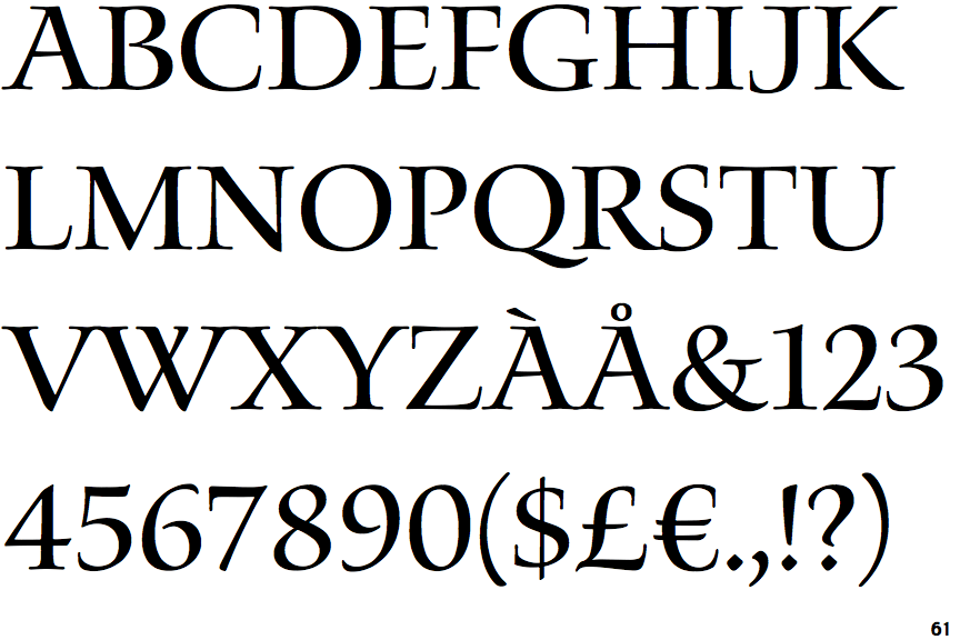
Waters Titling
 |
The upper-case 'Q' tail touches the circle.
|
 |
The upper-case 'J' sits on the baseline.
|
 |
The dot on the '?' (question-mark) is diamond-shaped or triangular.
|
 |
The upper-case 'U' has no stem/serif.
|
 |
The top of the upper-case 'W' has four upper terminals.
|
 |
The strokes are upright.
|
 |
The bar of the upper-case 'G' is double-sided.
|
Note that the fonts in the icons shown above represent general examples, not necessarily the two fonts chosen for comparison.
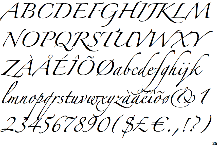
Show ExamplesZapfino
 |
The upper-case 'Q' tail crosses the circle.
|
 |
The upper-case 'J' descends below the baseline.
|
 |
The dot on the '?' (question-mark) is circular or oval.
|
 |
The upper-case 'U' has a stem/serif.
|
 |
The top of the upper-case 'W' has three upper terminals.
|
 |
The strokes are sloped right (italic, oblique, or cursive).
|
 |
The bar of the upper-case 'G' is single-sided, left-facing.
|

