 |
The dot on the '?' (question-mark) is diamond-shaped or triangular.
|
 |
The centre bar of the upper-case 'P' leaves a gap with the vertical.
|
 |
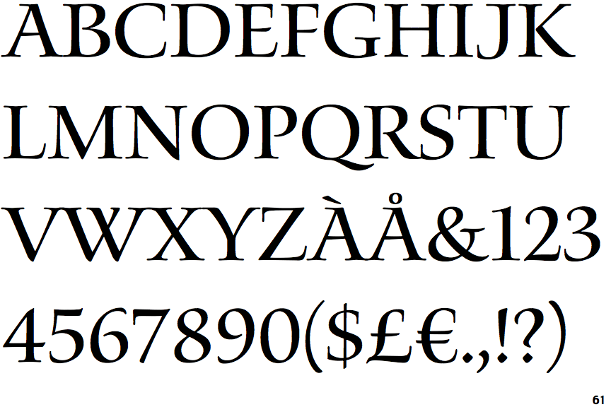
The characters are solid.
|
 |
The centre bar of the upper-case 'E' has no serifs.
|
 |
The upper-case 'G' foot has a forward pointing spur or serif.
|
 |
The top of the upper-case 'W' has four upper terminals.
|
 |
The centre bar of the upper-case 'F' has no serifs.
|
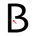 |
The centre bar of the upper-case 'B' leaves a gap with the vertical.
|
Note that the fonts in the icons shown above represent general examples, not necessarily the two fonts chosen for comparison.
Show Examples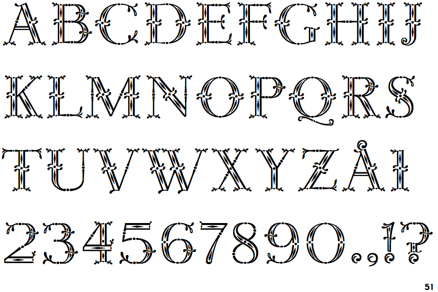
 |
The dot on the '?' (question-mark) is circular or oval.
|
 |
The centre bar of the upper-case 'P' meets the vertical.
|
 |
The characters are outlined, shaded, or filled with a pattern.
|
 |
The centre bar of the upper-case 'E' has serifs.
|
 |
The upper-case 'G' foot has no spur or serif.
|
 |
The top of the upper-case 'W' has three upper terminals.
|
 |
The centre bar of the upper-case 'F' has serifs.
|
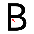 |
The centre bar of the upper-case 'B' meets the vertical.
|