 |
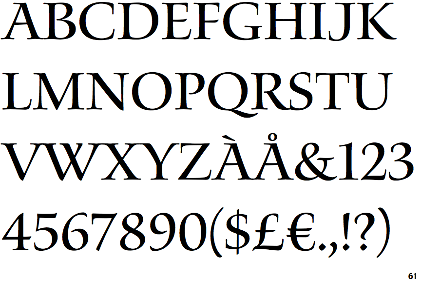
The '&' (ampersand) is traditional style with two enclosed loops.
|
 |
The upper-case 'J' sits on the baseline.
|
 |
The dot on the '?' (question-mark) is diamond-shaped or triangular.
|
 |
The upper-case 'U' has no stem/serif.
|
 |
The top of the upper-case 'A' has a serif or cusp on the left.
|
 |
The centre bar of the upper-case 'R' leaves a gap with the vertical.
|
 |
The top of the upper-case 'W' has four upper terminals.
|
 |
The tail of the upper-case 'J' has a flat end or cusp.
|
 |
The centre bar of the upper-case 'F' has no serifs.
|
Note that the fonts in the icons shown above represent general examples, not necessarily the two fonts chosen for comparison.
Show Examples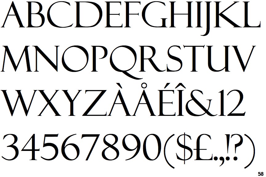
 |
The '&' (ampersand) is traditional style with a gap at the top.
|
 |
The upper-case 'J' descends below the baseline.
|
 |
The dot on the '?' (question-mark) is circular or oval.
|
 |
The upper-case 'U' has a stem/serif.
|
 |
The top of the upper-case 'A' has no serifs or cusps.
|
 |
The centre bar of the upper-case 'R' meets the vertical.
|
 |
The top of the upper-case 'W' has three upper terminals.
|
 |
The tail of the upper-case 'J' has a tapered end.
|
 |
The centre bar of the upper-case 'F' has serifs.
|