 |
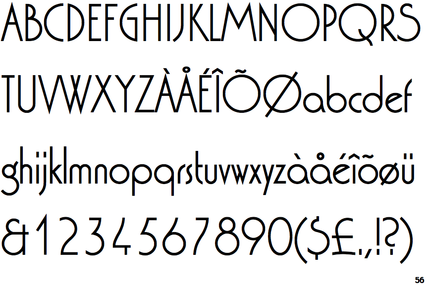
The '&' (ampersand) looks like 'Et' with one enclosed loop (with or without exit stroke).
|
 |
The characters do not have serifs.
|
 |
The centre vertex of the upper-case 'M' is above the baseline.
|
 |
The dot on the '?' (question-mark) is square or rectangular.
|
 |
The top storey of the '3' is a sharp angle.
|
 |
The centre bar of the upper-case 'P' meets the vertical.
|
 |
The lower-case 'g' is double-storey (with or without gap).
|
 |
The lower-case 'a' stem stops at the top of the bowl (single storey).
|
 |
The upper-case 'E' is normal letter shape.
|
 |
The centre bar of the upper-case 'R' meets the vertical.
|
There are more than ten differences; only the first ten are shown.
Note that the fonts in the icons shown above represent general examples, not necessarily the two fonts chosen for comparison.
Show Examples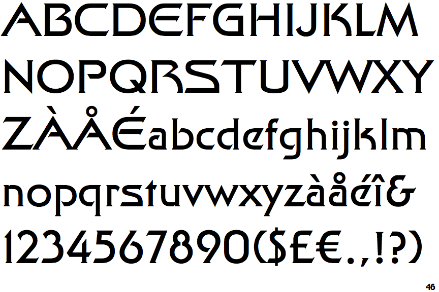
 |
The '&' (ampersand) looks like 'Et' with a gap at the top.
|
 |
The characters have serifs.
|
 |
The centre vertex of the upper-case 'M' is on the baseline.
|
 |
The dot on the '?' (question-mark) is circular or oval.
|
 |
The top storey of the '3' is a smooth curve.
|
 |
The centre bar of the upper-case 'P' leaves a gap with the vertical.
|
 |
The lower-case 'g' is single-storey (with or without loop).
|
 |
The lower-case 'a' stem curves over the top of the bowl (double storey).
|
 |
The upper-case 'E' is drawn as a 'C' with a bar.
|
 |
The centre bar of the upper-case 'R' leaves a gap with the vertical.
|