Identifont

Fonts by Appearance

Fonts by Name

Fonts by Similarity

Fonts by Picture

Fonts by Designer/Publisher

Differences

TweetTweet Differences

Compare: and  

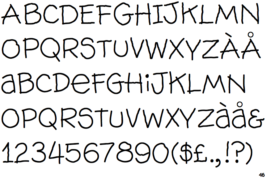
Wallow

Wallow

Gap top
The '&' (ampersand) looks like 'Et' with a gap at the top.
Above
The centre vertex of the upper-case 'M' is above the baseline.
2-Storey
The lower-case 'a' stem curves over the top of the bowl (double storey).

Note that the fonts in the icons shown above represent general examples, not necessarily the two fonts chosen for comparison.

Show Examples
Kidprint

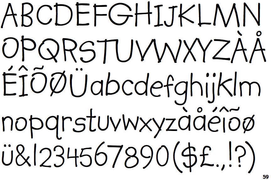
Kidprint

Closed
The '&' (ampersand) is traditional style with two enclosed loops.
Baseline
The centre vertex of the upper-case 'M' is on the baseline.
1-Storey
The lower-case 'a' stem stops at the top of the bowl (single storey).