 |
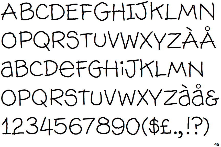
The upper-case 'J' sits on the baseline.
|
 |
The centre vertex of the upper-case 'M' is above the baseline.
|
 |
The upper-case 'U' has no stem/serif.
|
 |
The upper-case 'G' has double-sided bar.
|
 |
The upper-case 'Y' arms and tail are separate strokes.
|
 |
The upper-case 'J' has a bar both sides.
|
 |
The sides of the lower-case 'y' are angled (V-shaped).
|
 |
The tail of the upper-case 'Q' is straight.
|
 |
The lower-case 'u' has no stem/serif.
|
 |
The upper-case letter 'I' has serifs/bars.
|
Note that the fonts in the icons shown above represent general examples, not necessarily the two fonts chosen for comparison.
Show Examples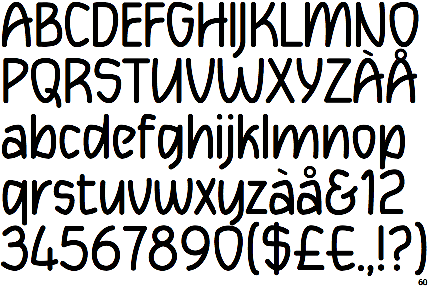
 |
The upper-case 'J' descends below the baseline.
|
 |
The centre vertex of the upper-case 'M' is on the baseline.
|
 |
The upper-case 'U' has a stem/serif.
|
 |
The upper-case 'G' has a bar to the left.
|
 |
The upper-case 'Y' right-hand arm forms a continuous stroke with the tail.
|
 |
The upper-case 'J' has no bar.
|
 |
The sides of the lower-case 'y' are parallel (U-shaped).
|
 |
The tail of the upper-case 'Q' is curved or S-shaped.
|
 |
The lower-case 'u' has a stem/serif.
|
 |
The upper-case letter 'I' is plain.
|