 |
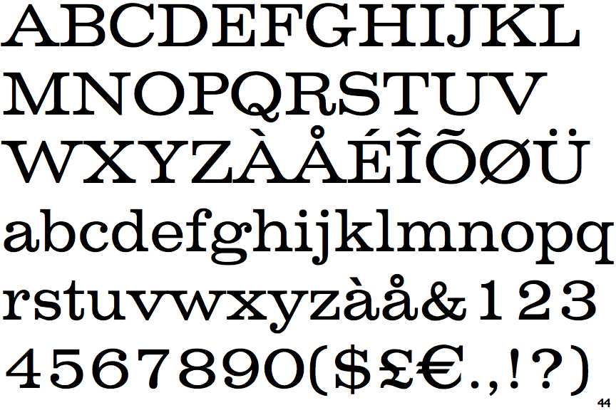
The upper-case 'Q' tail crosses the circle.
|
 |
The top of the lower-case 'q' has a right-facing serif.
|
 |
The foot of the '4' has double-sided serifs.
|
 |
The centre vertex of the upper-case 'W' has no serifs.
|
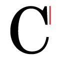 |
The top serif of the upper-case 'C' is vertical or nearly vertical.
|
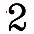 |
The top stroke of the '2' has a ball.
|
 |
The foot of the '£' (pound) has no loop.
|
Note that the fonts in the icons shown above represent general examples, not necessarily the two fonts chosen for comparison.
Show Examples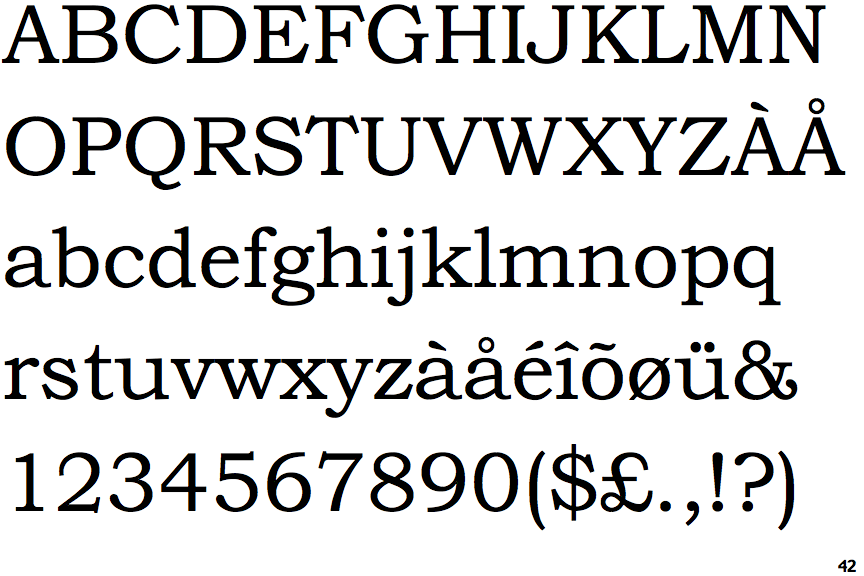
 |
The upper-case 'Q' tail touches the circle.
|
 |
The top of the lower-case 'q' has a vertical or slightly angled spur (pointed or flat).
|
 |
The foot of the '4' has no serifs.
|
 |
The centre vertex of the upper-case 'W' has two separate serifs.
|
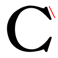 |
The top serif of the upper-case 'C' is angled left.
|
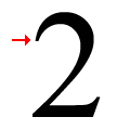 |
The top stroke of the '2' has a point or cusp.
|
 |
The foot of the '£' (pound) has a loop.
|