Identifont

Fonts by Appearance

Fonts by Name

Fonts by Similarity

Fonts by Picture

Fonts by Designer/Publisher

Differences

TweetTweet Differences

Compare: and  

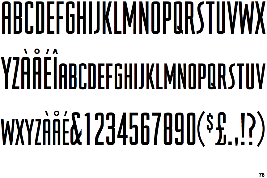
Viking Gothic

Viking Gothic

Crosses
The upper-case 'Q' tail crosses the circle.
Open
The '&' (ampersand) is traditional style with a gap at the top.
Closed
The '4' is closed.
Parallel
The verticals of the upper-case 'M' are parallel.
Parallel
The upper-case 'A' has parallel verticals.
Flat
The right side of the upper-case 'G' has a flat section.

Note that the fonts in the icons shown above represent general examples, not necessarily the two fonts chosen for comparison.

Show Examples
Senegal Bold

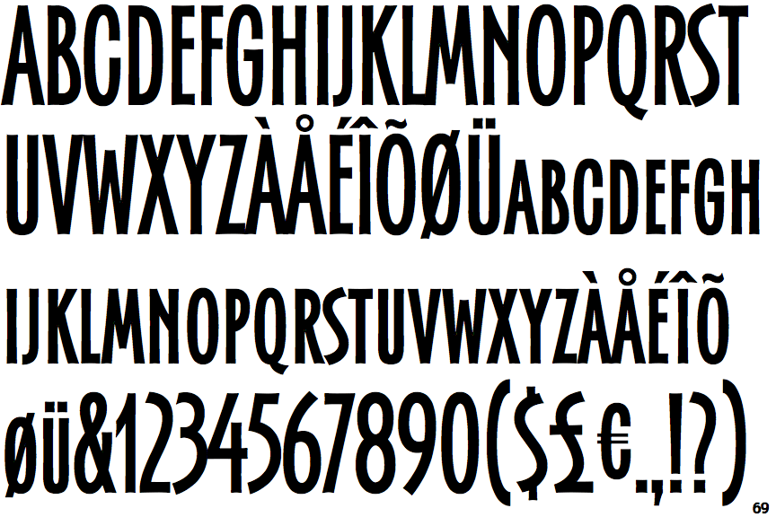
Senegal Bold

Touches
The upper-case 'Q' tail touches the circle.
Closed
The '&' (ampersand) is traditional style with two enclosed loops.
Open
The '4' is open.
Sloping
The verticals of the upper-case 'M' are sloping.
Tapered
The upper-case 'A' has tapered verticals.
Curved
The right side of the upper-case 'G' is curved.