Identifont

Fonts by Appearance

Fonts by Name

Fonts by Similarity

Fonts by Picture

Fonts by Designer/Publisher

Differences

TweetTweet Differences

Compare: and  

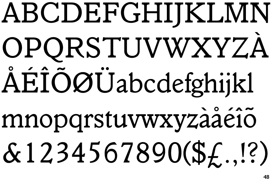
Veronese

Veronese

Open
The '&' (ampersand) is traditional style with a gap at the top.
Circle
The dot on the '?' (question-mark) is circular or oval.
Top serif
The top stroke of the upper-case 'C' has a vertical or angled upward-pointing serif.
Smooth
The character outlines are smooth/sharp.

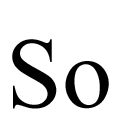
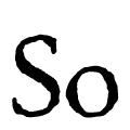
Note that the fonts in the icons shown above represent general examples, not necessarily the two fonts chosen for comparison.

Show Examples
P22 Morris Golden

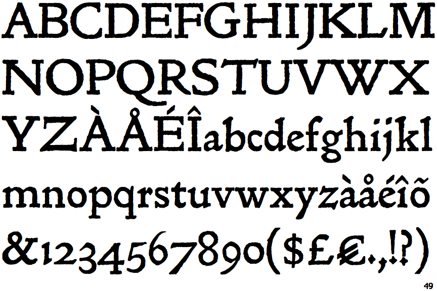
P22 Morris Golden

Closed
The '&' (ampersand) is traditional style with two enclosed loops.
Diamond
The dot on the '?' (question-mark) is diamond-shaped or triangular.
No top serif
The top stroke of the upper-case 'C' has no upward-pointing serif.
Corroded
The character outlines are corroded, roughened, or dirty.