Identifont

Fonts by Appearance

Fonts by Name

Fonts by Similarity

Fonts by Picture

Fonts by Designer/Publisher

Differences

TweetTweet Differences

Compare: and  

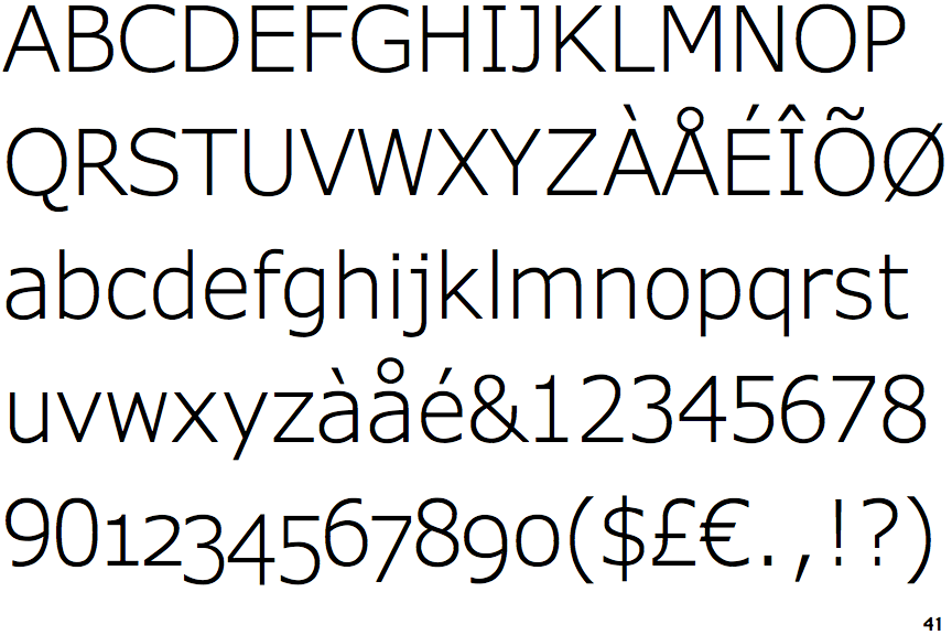
Verdana Pro Light

Verdana Pro Light

On
The upper-case 'J' sits on the baseline.
Double
The diagonal strokes of the upper-case 'K' meet in a 'T'.
Left
The upper-case 'G' has a bar to the left.
Single-bar
The upper-case 'J' has a bar to the left.
Serifs
The upper-case letter 'I' has serifs/bars.

Note that the fonts in the icons shown above represent general examples, not necessarily the two fonts chosen for comparison.

Show Examples
Lucida Grande

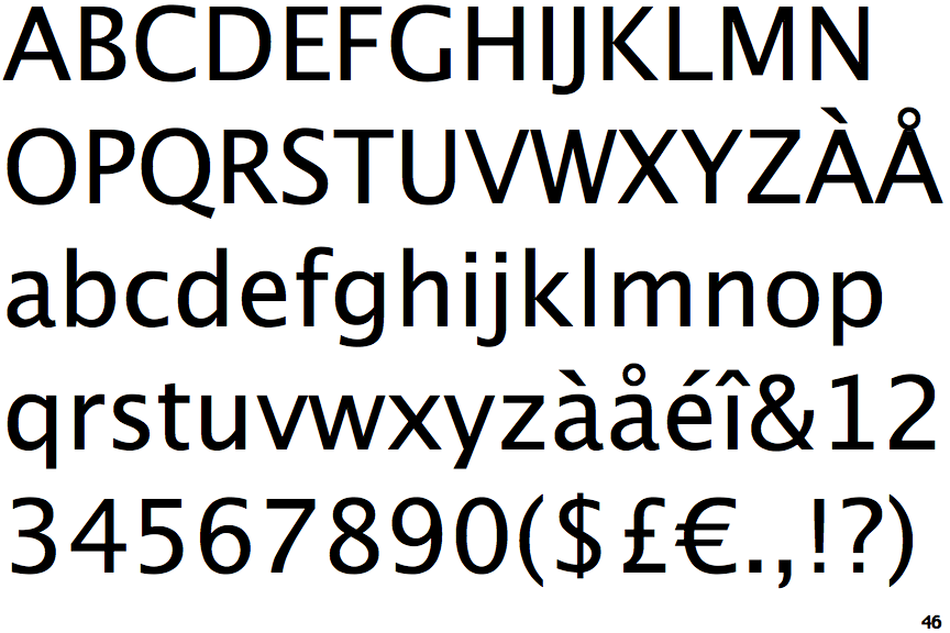
Lucida Grande

Below
The upper-case 'J' descends below the baseline.
Single
The diagonal strokes of the upper-case 'K' meet at the vertical (with or without a gap).
No bar
The upper-case 'G' has no bar.
Plain
The upper-case 'J' has no bar.
Plain
The upper-case letter 'I' is plain.