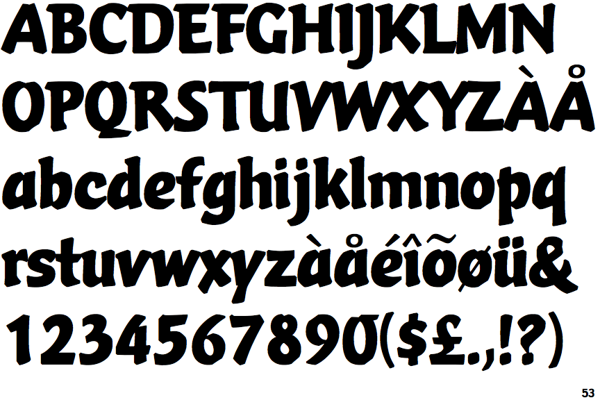
 |
The upper-case 'Q' tail touches the circle.
|
 |
The '&' (ampersand) is traditional style with two enclosed loops.
|
 |
The upper-case 'J' descends below the baseline.
|
 |
The diagonal strokes of the upper-case 'K' meet in a 'T'.
|
 |
The upper-case 'U' has a stem/serif.
|
 |
The top of the upper-case 'A' has no serifs or cusps.
|
 |
The sides of the lower-case 'y' are angled (V-shaped).
|
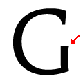 |
The bar of the upper-case 'G' is no bar.
|
 |
The lower-case 'e' has a curved bar with no straight segment.
|
 |
The right side of the upper-case 'G' has a flat section.
|
There are more than ten differences; only the first ten are shown.
Note that the fonts in the icons shown above represent general examples, not necessarily the two fonts chosen for comparison.
Show Examples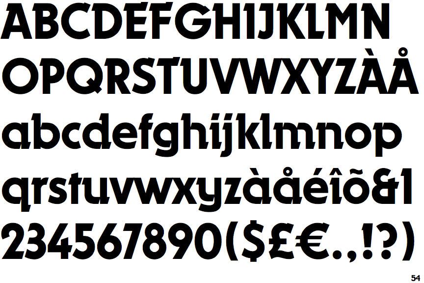
 |
The upper-case 'Q' tail crosses the circle.
|
 |
The '&' (ampersand) looks like 'Et' with one enclosed loop (with or without exit stroke).
|
 |
The upper-case 'J' sits on the baseline.
|
 |
The diagonal strokes of the upper-case 'K' meet at the vertical (with or without a gap).
|
 |
The upper-case 'U' has no stem/serif.
|
 |
The top of the upper-case 'A' has a serif or cusp on the left.
|
 |
The sides of the lower-case 'y' are parallel (U-shaped).
|
 |
The bar of the upper-case 'G' is single-sided, left-facing.
|
 |
The lower-case 'e' has a straight horizontal bar.
|
 |
The right side of the upper-case 'G' is curved.
|