Identifont

Fonts by Appearance

Fonts by Name

Fonts by Similarity

Fonts by Picture

Fonts by Designer/Publisher

Differences

TweetTweet Differences

Compare: and  

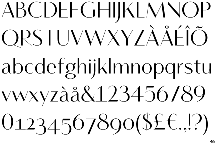
Vanitas Bold

Vanitas Bold

Below
The upper-case 'J' descends below the baseline.
Circle
The dot on the '?' (question-mark) is circular or oval.
Sloping
The verticals of the upper-case 'M' are sloping.
No spur
The upper-case 'G' has no spur/tail.
No bar
The upper-case 'G' has no bar.
Straight
The leg of the upper-case 'R' is straight.

Note that the fonts in the icons shown above represent general examples, not necessarily the two fonts chosen for comparison.

Show Examples
Beausite Grand Thin

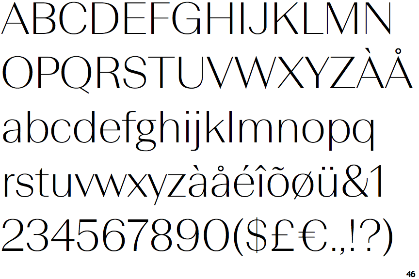
Beausite Grand Thin

On
The upper-case 'J' sits on the baseline.
Square/rectangular
The dot on the '?' (question-mark) is square or rectangular.
Parallel
The verticals of the upper-case 'M' are parallel.
Spur
The upper-case 'G' has a spur/tail.
Left
The upper-case 'G' has a bar to the left.
Outwards
The leg of the upper-case 'R' is curved outwards.