 |
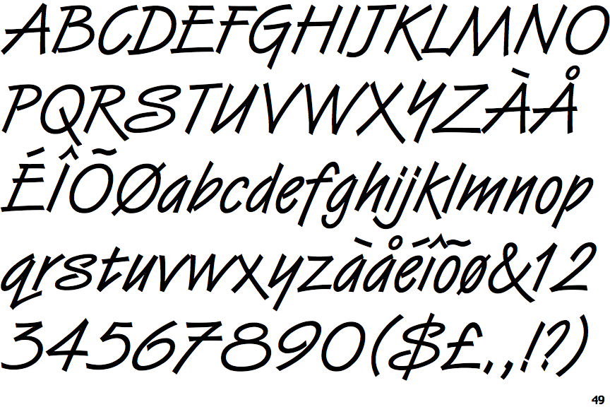
The upper-case 'J' sits on the baseline.
|
 |
The '4' is closed.
|
 |
The centre vertex of the upper-case 'M' is on the baseline.
|
 |
The top storey of the '3' is a sharp angle.
|
 |
The upper-case 'U' has a stem/serif.
|
 |
The upper-case 'G' has a spur/tail.
|
 |
The upper-case 'J' has a bar both sides.
|
 |
The '7' has a bar.
|
 |
The tail of the lower-case 'y' is substantially straight.
|
 |
The foot of the '£' (pound) has no loop.
|
Note that the fonts in the icons shown above represent general examples, not necessarily the two fonts chosen for comparison.
Show Examples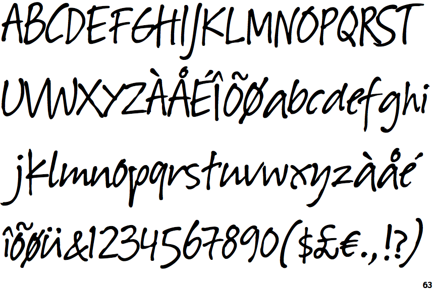
 |
The upper-case 'J' descends below the baseline.
|
 |
The '4' is open.
|
 |
The centre vertex of the upper-case 'M' is above the baseline.
|
 |
The top storey of the '3' is a smooth curve.
|
 |
The upper-case 'U' has no stem/serif.
|
 |
The upper-case 'G' has no spur/tail.
|
 |
The upper-case 'J' has no bar.
|
 |
The '7' has no bar.
|
 |
The tail of the lower-case 'y' curves or points to the left without a loop.
|
 |
The foot of the '£' (pound) has a loop.
|