 |
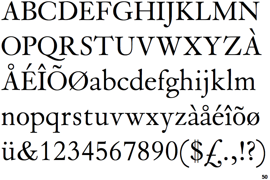
The '$' (dollar) has a double line crossing the 'S'.
|
 |
The centre bar of the upper-case 'P' leaves a gap with the vertical.
|
 |
The top stroke of the upper-case 'C' has no upward-pointing serif.
|
 |
The upper-case 'G' foot has a forward pointing spur or serif.
|
 |
The foot of the '4' has no serifs.
|
Note that the fonts in the icons shown above represent general examples, not necessarily the two fonts chosen for comparison.
Show Examples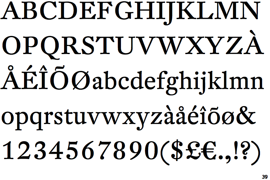
 |
The '$' (dollar) has a single line crossing the 'S'.
|
 |
The centre bar of the upper-case 'P' meets the vertical.
|
 |
The top stroke of the upper-case 'C' has a vertical or angled upward-pointing serif.
|
 |
The upper-case 'G' foot has a downward pointing spur.
|
 |
The foot of the '4' has double-sided serifs.
|