 |
The upper-case 'Q' tail touches the circle.
|
 |
The '&' (ampersand) looks like 'Et' with a gap at the top.
|
 |
The '4' is open.
|
 |
The top storey of the '3' is a smooth curve.
|
 |
The centre bar of the upper-case 'P' leaves a gap with the vertical.
|
 |
The centre bar of the upper-case 'R' leaves a gap with the vertical.
|
 |
The '7' has no bar.
|
 |
The tail of the lower-case 'f' descends below the baseline.
|
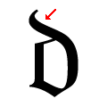 |
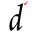
The ascender of the lower-case 'd' curves towards the left.
|
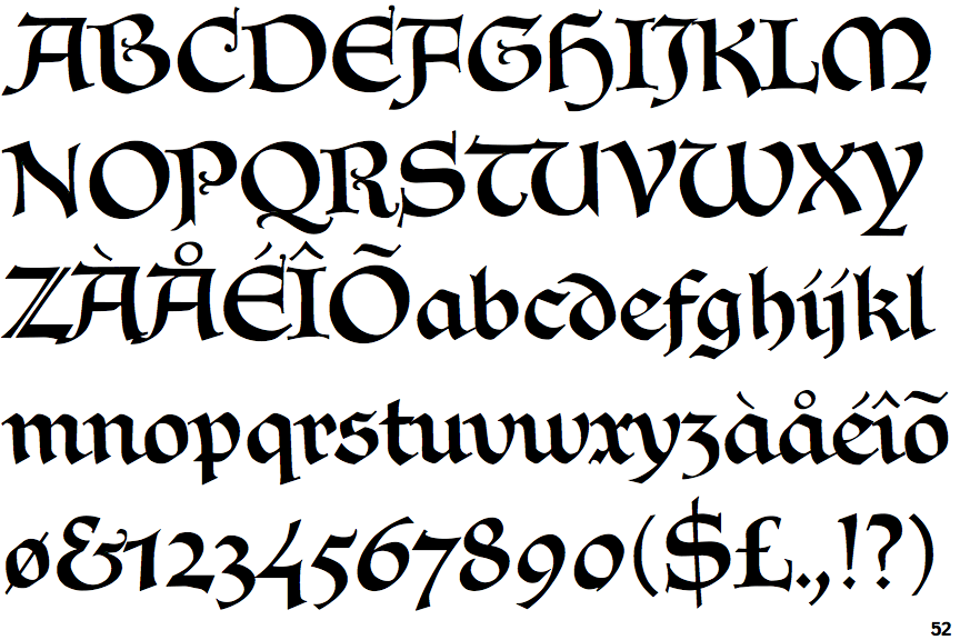
Note that the fonts in the icons shown above represent general examples, not necessarily the two fonts chosen for comparison.
Show Examples
 |
The upper-case 'Q' tail crosses the circle.
|
 |
The '&' (ampersand) is traditional style with two enclosed loops.
|
 |
The '4' is closed.
|
 |
The top storey of the '3' is a sharp angle.
|
 |
The centre bar of the upper-case 'P' meets the vertical.
|
 |
The centre bar of the upper-case 'R' meets the vertical.
|
 |
The '7' has a bar.
|
 |
The tail of the lower-case 'f' sits on the baseline.
|
 |
The ascender of the lower-case 'd' is straight.
|