Differences
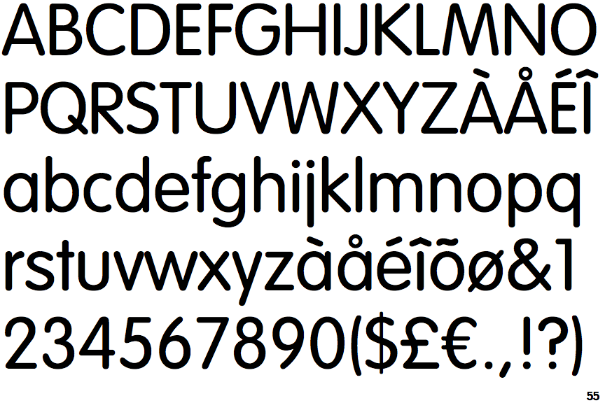
VAG Rundschrift Light
 |
The centre vertex of the upper-case 'M' is on the baseline.
|
 |
The verticals of the upper-case 'M' are sloping.
|
 |
The lower-case 'g' is single-storey (with or without loop).
|
 |
The lower-case 'a' stem stops at the top of the bowl (single storey).
|
 |
The upper-case 'G' has no spur/tail.
|
 |
The lower-case 'u' has no stem/serif.
|
 |
The tail of the lower-case 't' is straight.
|
 |
The tail of the lower-case 'j' is straight with no upper serif.
|
Note that the fonts in the icons shown above represent general examples, not necessarily the two fonts chosen for comparison.
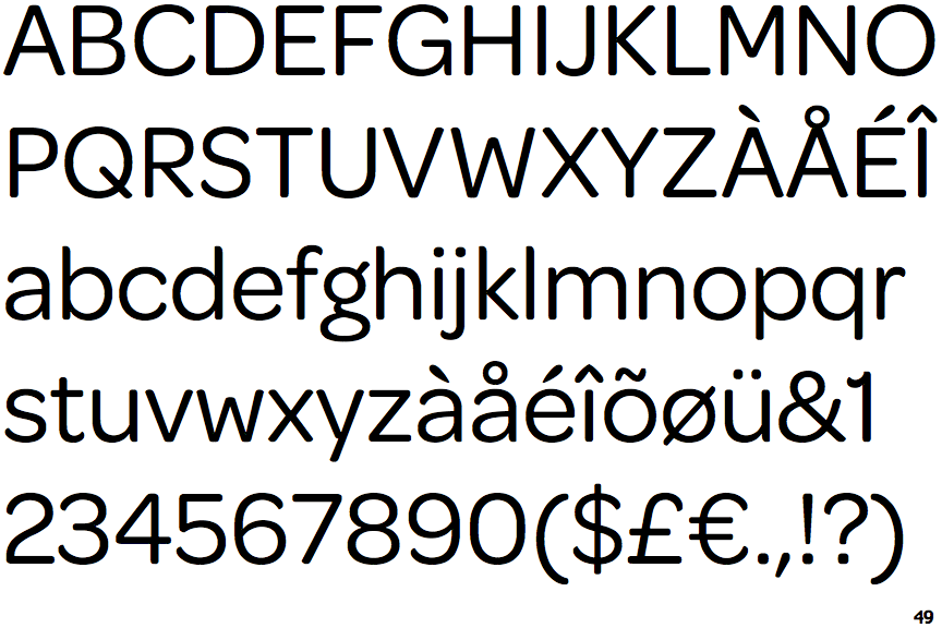
Show ExamplesOmnes
 |
The centre vertex of the upper-case 'M' is above the baseline.
|
 |
The verticals of the upper-case 'M' are parallel.
|
 |
The lower-case 'g' is double-storey (with or without gap).
|
 |
The lower-case 'a' stem curves over the top of the bowl (double storey).
|
 |
The upper-case 'G' has a spur/tail.
|
 |
The lower-case 'u' has a stem/serif.
|
 |
The tail of the lower-case 't' is curved.
|
 |
The tail of the lower-case 'j' is curved with no upper serif.
|
