 |
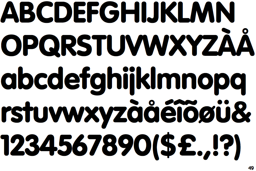
The upper-case 'Q' tail crosses the circle.
|
 |
The '$' (dollar) has a single line crossing the 'S'.
|
 |
The '&' (ampersand) is traditional style with two enclosed loops.
|
 |
The '4' is closed.
|
 |
The diagonal strokes of the upper-case 'K' meet at the vertical (with or without a gap).
|
 |
The top storey of the '3' is a smooth curve.
|
 |
The tail of the lower-case 'y' is substantially straight.
|
 |
The lower-case 'u' has no stem/serif.
|
 |
The tail of the lower-case 't' is straight.
|
 |
The tail of the lower-case 'j' is straight with no upper serif.
|
Note that the fonts in the icons shown above represent general examples, not necessarily the two fonts chosen for comparison.
Show Examples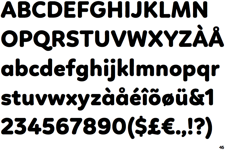
 |
The upper-case 'Q' tail touches the circle.
|
 |
The '$' (dollar) has a single line which does not cross the 'S'.
|
 |
The '&' (ampersand) is traditional style with a gap at the top.
|
 |
The '4' is open.
|
 |
The diagonal strokes of the upper-case 'K' meet in a 'T'.
|
 |
The top storey of the '3' is a sharp angle.
|
 |
The tail of the lower-case 'y' is curved or U-shaped to the left.
|
 |
The lower-case 'u' has a stem/serif.
|
 |
The tail of the lower-case 't' is curved.
|
 |
The tail of the lower-case 'j' is curved with no upper serif.
|