Differences
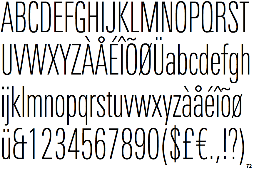
Univers Next Thin Compressed
 |
The '&' (ampersand) looks like 'Et' with one enclosed loop (with or without exit stroke).
|
 |
The upper-case 'J' sits on the baseline.
|
 |
The centre vertex of the upper-case 'M' is on the baseline.
|
 |
The lower-case 'g' is single-storey (with or without loop).
|
 |
The tail of the upper-case 'Q' is straight (horizontal, diagonal, or vertical).
|
 |
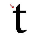
The lower-case 't' has double-sided bar which forms a right-angle with the vertical.
|
Note that the fonts in the icons shown above represent general examples, not necessarily the two fonts chosen for comparison.
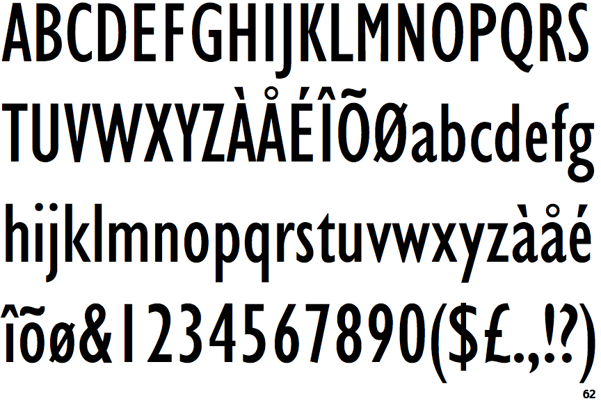
Show ExamplesGill Sans Condensed
 |
The '&' (ampersand) is traditional style with two enclosed loops.
|
 |
The upper-case 'J' descends below the baseline.
|
 |
The centre vertex of the upper-case 'M' is above the baseline.
|
 |
The lower-case 'g' is double-storey (with or without gap).
|
 |
The tail of the upper-case 'Q' is curved, S-shaped, or Z-shaped.
|
 |
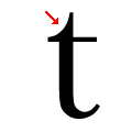
The lower-case 't' has double-sided bar which forms a diagonal with the vertical.
|

