 |
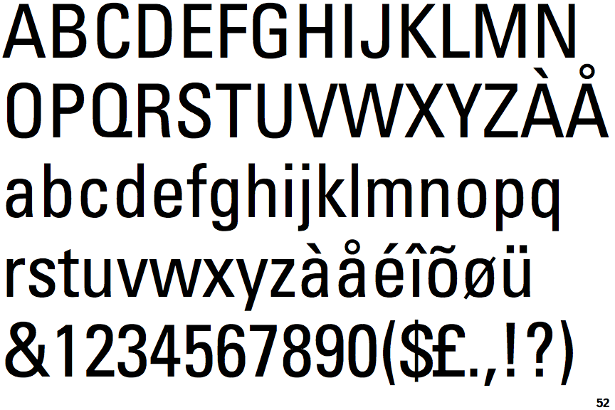
The upper-case 'J' sits on the baseline.
|
 |
The dot on the '?' (question-mark) is square or rectangular.
|
 |
The lower-case 'g' is single-storey (with or without loop).
|
 |
The leg of the upper-case 'R' is curved outwards.
|
 |
The top of the lower-case 'q' has a vertical or slightly angled spur (pointed or flat).
|
 |
The dot on the lower-case 'i' or 'j' is square or rectangular.
|
 |
The lower-case 'e' has a straight horizontal bar.
|
 |
The tail of the upper-case 'Q' is straight (horizontal, diagonal, or vertical).
|
 |
The tail of the lower-case 'y' is substantially straight.
|
 |
The lower-case 'u' has a stem/serif.
|
There are more than ten differences; only the first ten are shown.
Note that the fonts in the icons shown above represent general examples, not necessarily the two fonts chosen for comparison.
Show Examples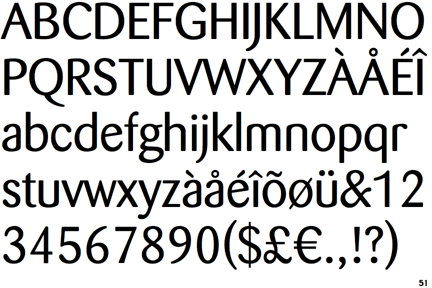
 |
The upper-case 'J' descends below the baseline.
|
 |
The dot on the '?' (question-mark) is circular or oval.
|
 |
The lower-case 'g' is double-storey (with or without gap).
|
 |
The leg of the upper-case 'R' is straight.
|
 |
The top of the lower-case 'q' has no spur or serif.
|
 |
The dot on the lower-case 'i' or 'j' is circular or oval.
|
 |
The lower-case 'e' has a straight angled bar.
|
 |
The tail of the upper-case 'Q' is curved, S-shaped, or Z-shaped.
|
 |
The tail of the lower-case 'y' is curved or U-shaped to the left.
|
 |
The lower-case 'u' has no stem/serif.
|