 |
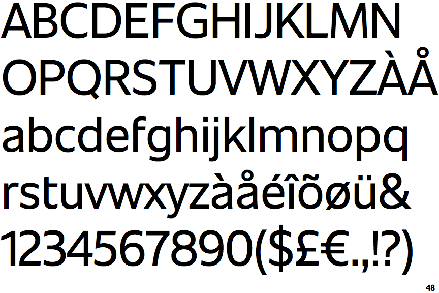
The upper-case 'Q' tail touches the circle.
|
 |
The diagonal strokes of the upper-case 'K' meet in a 'T'.
|
 |
The 'l' (lower-case 'L') has no serifs or tail.
|
 |
The upper-case 'J' has no bar.
|
 |
The top of the lower-case 'q' has a vertical or slightly angled spur (pointed or flat).
|
 |
The sides of the lower-case 'y' are angled (V-shaped).
|
 |
The bar of the lower-case 'f' is single-sided.
|
 |
The lower-case 'u' has a stem/serif.
|
 |
The upper-case letter 'I' is plain.
|
 |
The lower-case 'i' has no serifs or tail.
|
There are more than ten differences; only the first ten are shown.
Note that the fonts in the icons shown above represent general examples, not necessarily the two fonts chosen for comparison.
Show Examples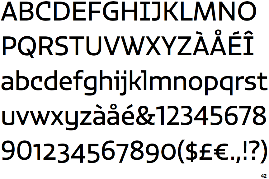
 |
The upper-case 'Q' tail crosses the circle.
|
 |
The diagonal strokes of the upper-case 'K' connect to the vertical via a horizontal bar.
|
 |
The 'l' (lower-case 'L') has a left-facing upper serif.
|
 |
The upper-case 'J' has a bar to the left.
|
 |
The top of the lower-case 'q' has no spur or serif.
|
 |
The sides of the lower-case 'y' are parallel (U-shaped).
|
 |
The bar of the lower-case 'f' is double-sided.
|
 |
The lower-case 'u' has no stem/serif.
|
 |
The upper-case letter 'I' has serifs/bars.
|
 |
The lower-case 'i' has a left-facing upper serif.
|