 |
The upper-case 'Q' tail touches the circle.
|
 |
The '4' is open.
|
 |
The centre bar of the upper-case 'P' leaves a gap with the vertical.
|
 |
The upper-case 'E' is normal letter shape.
|
 |
The centre bar of the upper-case 'R' leaves a gap with the vertical.
|
 |
The tail of the upper-case 'T' is straight.
|
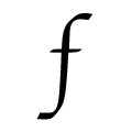 |
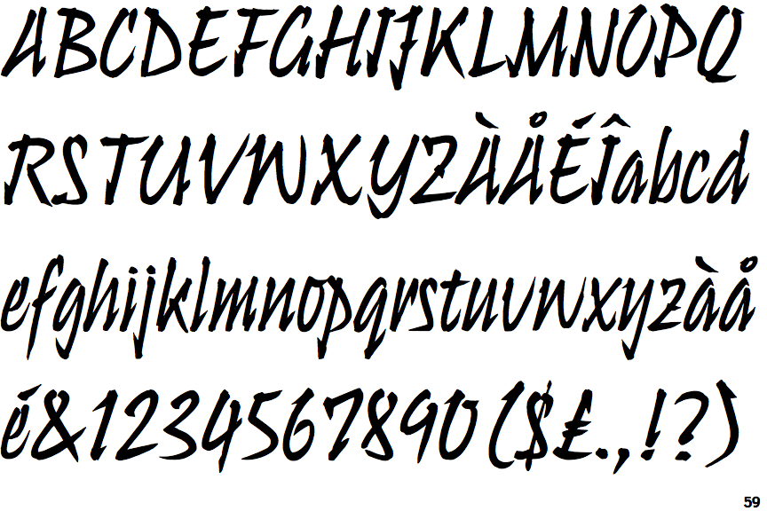
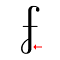
The stroke of the lower-case 'f' has no loops.
|
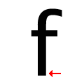 |
The tail of the lower-case 'f' is straight.
|
Note that the fonts in the icons shown above represent general examples, not necessarily the two fonts chosen for comparison.
Show Examples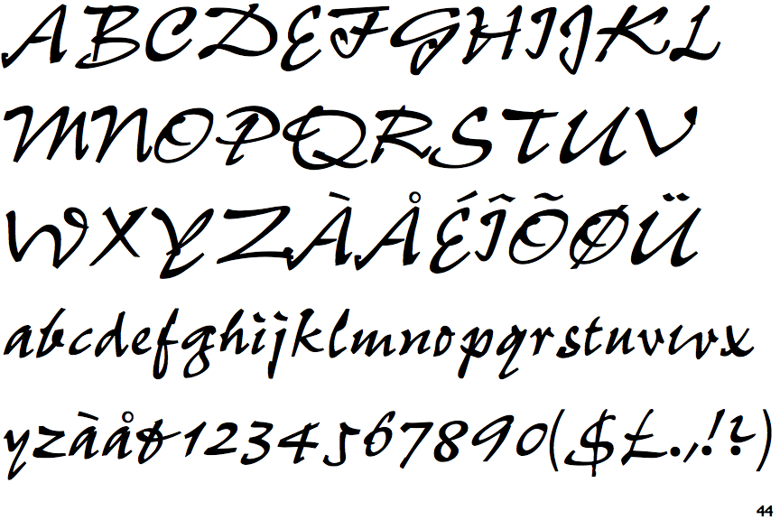
 |
The upper-case 'Q' tail crosses the circle.
|
 |
The '4' is closed.
|
 |
The centre bar of the upper-case 'P' crosses the vertical.
|
 |
The upper-case 'E' is drawn as a single stroke (with or without loop).
|
 |
The centre bar of the upper-case 'R' crosses the vertical.
|
 |
The tail of the upper-case 'T' curves to the right.
|
 |
The stroke of the lower-case 'f' has a lower loop only.
|
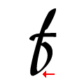 |
The tail of the lower-case 'f' curves or loops to the right.
|