 |
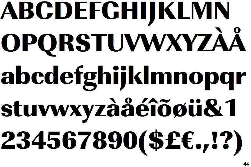
The verticals of the upper-case 'M' are parallel.
|
 |
The leg of the upper-case 'R' is curved outwards.
|
 |
The top of the lower-case 'q' has a vertical or slightly angled spur (pointed or flat).
|
 |
The tail of the lower-case 'y' is curved or U-shaped to the left.
|
 |
The lower-case 't' has double-sided bar which forms a right-angle with the vertical.
|
Note that the fonts in the icons shown above represent general examples, not necessarily the two fonts chosen for comparison.
Show Examples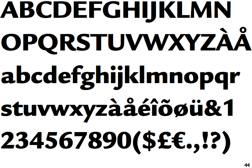
 |
The verticals of the upper-case 'M' are sloping.
|
 |
The leg of the upper-case 'R' is curved inwards.
|
 |
The top of the lower-case 'q' has no spur or serif.
|
 |
The tail of the lower-case 'y' is substantially straight.
|
 |
The lower-case 't' has double-sided bar which forms a diagonal with the vertical.
|