Identifont

Fonts by Appearance

Fonts by Name

Fonts by Similarity

Fonts by Picture

Fonts by Designer/Publisher

Differences

TweetTweet Differences

Compare: and  

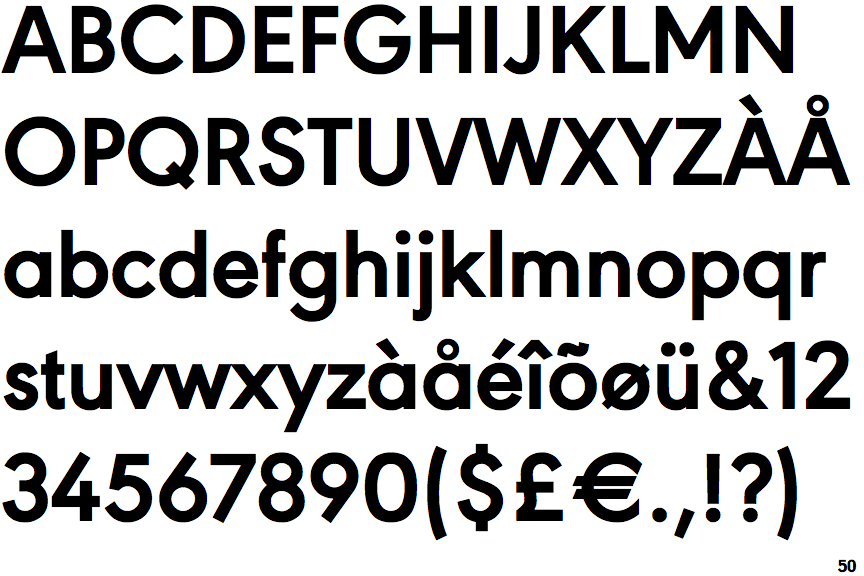
URW Geometric Bold

URW Geometric Bold

Open
The '4' is open.
Double
The diagonal strokes of the upper-case 'K' meet in a 'T'.
Round
The top storey of the '3' is a smooth curve.
1-Storey
The lower-case 'a' stem stops at the top of the bowl (single storey).
Curved
The right side of the upper-case 'G' is curved.

Note that the fonts in the icons shown above represent general examples, not necessarily the two fonts chosen for comparison.

Show Examples
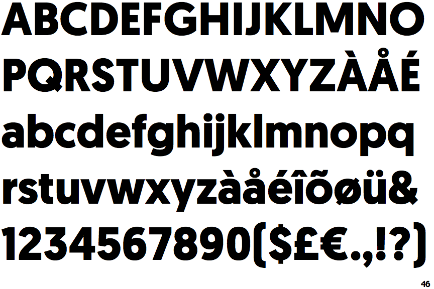
Geomanist Bold

Geomanist Bold

Closed
The '4' is closed.
Single
The diagonal strokes of the upper-case 'K' meet at the vertical (with or without a gap).
Angled
The top storey of the '3' is a sharp angle.
2-Storey
The lower-case 'a' stem curves over the top of the bowl (double storey).
Flat
The right side of the upper-case 'G' has a flat section.