 |
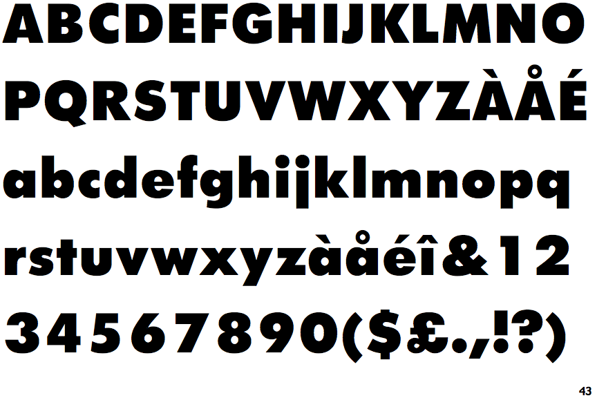
The upper-case 'Q' tail touches the circle.
|
 |
The '$' (dollar) has a single line which does not cross the 'S'.
|
 |
The upper-case 'J' sits on the baseline.
|
 |
The lower-case 'a' stem stops at the top of the bowl (single storey).
|
 |
The upper-case 'G' has a bar to the left.
|
 |
The lower-case 'u' has no stem/serif.
|
Note that the fonts in the icons shown above represent general examples, not necessarily the two fonts chosen for comparison.
Show Examples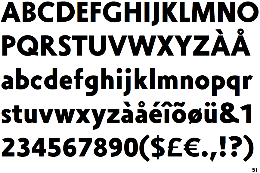
 |
The upper-case 'Q' tail crosses the circle.
|
 |
The '$' (dollar) has a single line crossing the 'S'.
|
 |
The upper-case 'J' descends below the baseline.
|
 |
The lower-case 'a' stem curves over the top of the bowl (double storey).
|
 |
The upper-case 'G' has no bar.
|
 |
The lower-case 'u' has a stem/serif.
|