Identifont

Fonts by Appearance

Fonts by Name

Fonts by Similarity

Fonts by Picture

Fonts by Designer/Publisher

Differences

TweetTweet Differences

Compare: and  

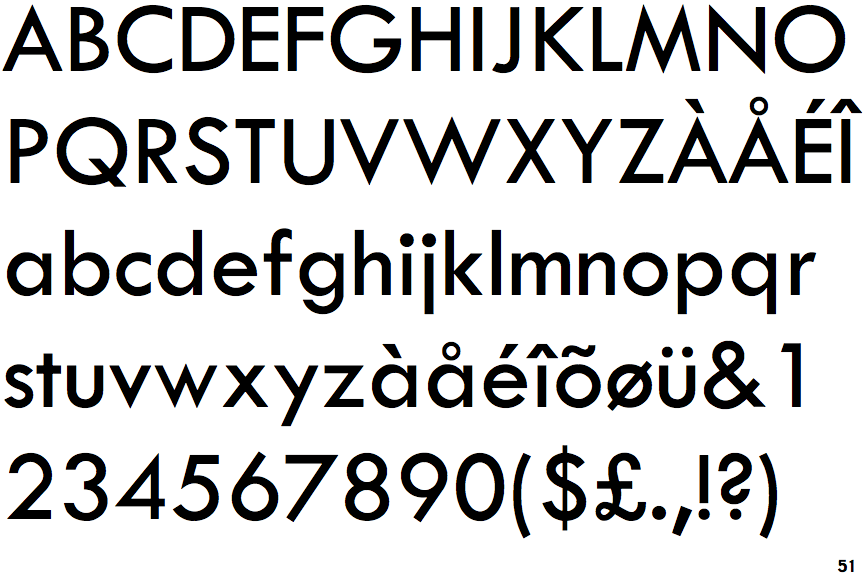
Twentieth Century

Twentieth Century

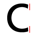
Vertical
The ends of the upper-case 'C' stroke are vertical or nearly vertical.
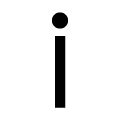
Straight-Plain
The tail of the lower-case 'j' is straight with no upper serif.

Note that the fonts in the icons shown above represent general examples, not necessarily the two fonts chosen for comparison.

Show Examples
Century Gothic

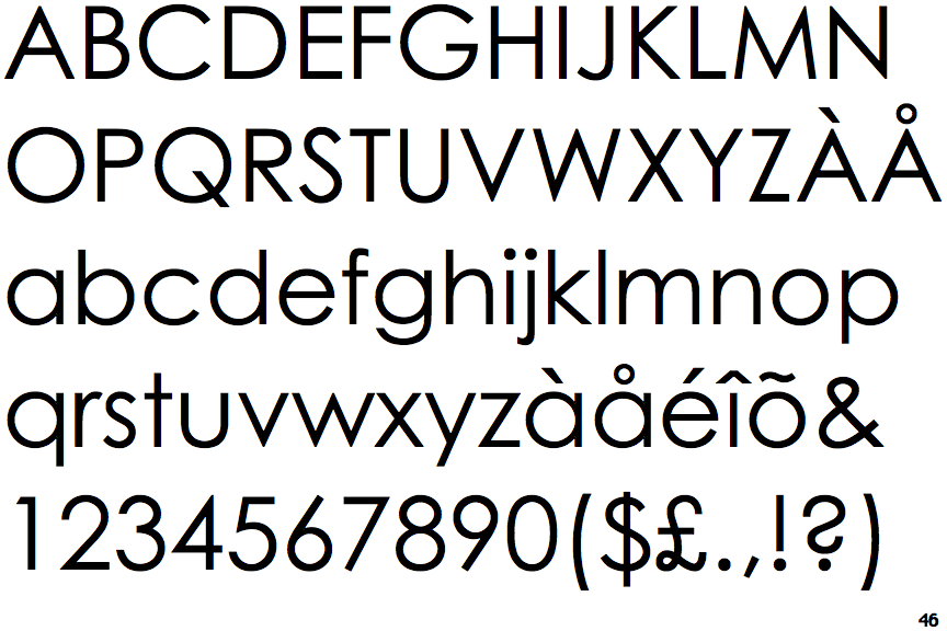
Century Gothic

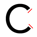
Angled
The ends of the upper-case 'C' stroke are angled.
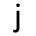
Curved-Plain
The tail of the lower-case 'j' is curved with no upper serif.