 |
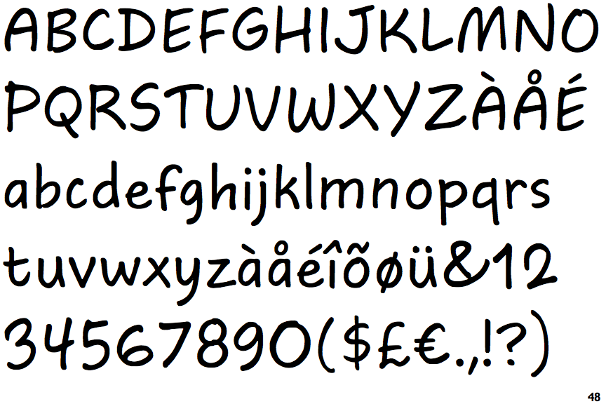
The '4' is open.
|
 |
The centre vertex of the upper-case 'M' is on the baseline.
|
 |
The top storey of the '3' is a smooth curve.
|
 |
The upper-case 'G' has no spur/tail.
|
 |
The upper-case 'G' has a bar to the left.
|
 |
The upper-case 'Y' right-hand arm forms a continuous stroke with the tail.
|
 |
The upper-case 'J' has a bar both sides.
|
 |
The leg of the upper-case 'R' is curved outwards.
|
Note that the fonts in the icons shown above represent general examples, not necessarily the two fonts chosen for comparison.
Show Examples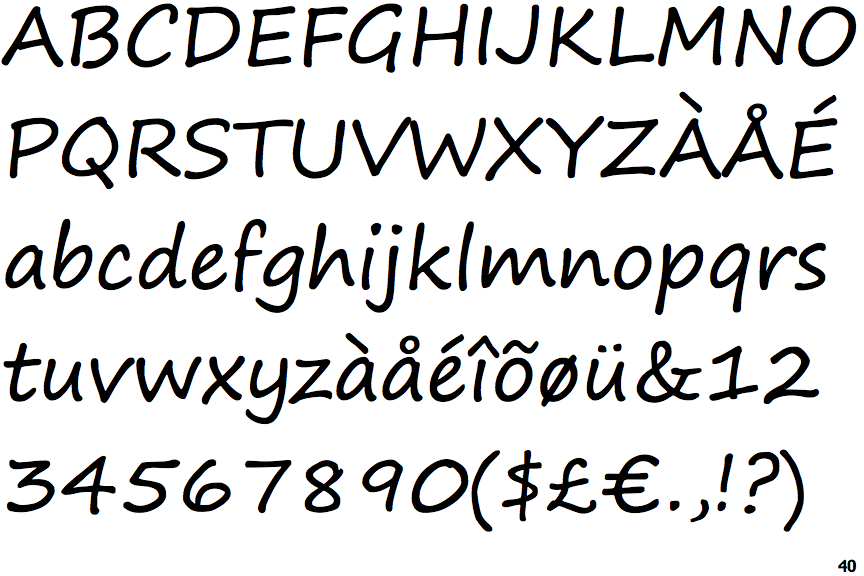
 |
The '4' is closed.
|
 |
The centre vertex of the upper-case 'M' is above the baseline.
|
 |
The top storey of the '3' is a sharp angle.
|
 |
The upper-case 'G' has a spur/tail.
|
|
The upper-case 'G' has no bar.
|
 |
The upper-case 'Y' arms and tail are separate strokes.
|
 |
The upper-case 'J' has no bar.
|
 |
The leg of the upper-case 'R' is straight.
|