Identifont

Fonts by Appearance

Fonts by Name

Fonts by Similarity

Fonts by Picture

Fonts by Designer/Publisher

Differences

TweetTweet Differences

Compare: and  

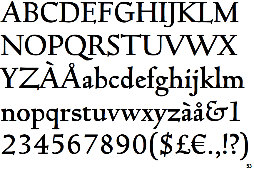
Truesdell Bold

Truesdell Bold

Gap top
The '&' (ampersand) looks like 'Et' with a gap at the top.
Single
The diagonal strokes of the upper-case 'K' meet at the vertical (with or without a gap).
No-Spur
The upper-case 'G' foot has no spur or serif.
No gap
The lower storey of the lower-case 'g' has no gap.

Note that the fonts in the icons shown above represent general examples, not necessarily the two fonts chosen for comparison.

Show Examples
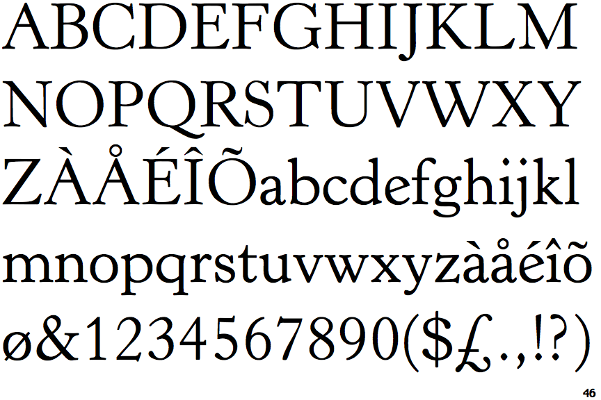
Horley Old Style

Horley Old Style

Closed
The '&' (ampersand) is traditional style with two enclosed loops.
Double
The diagonal strokes of the upper-case 'K' meet in a 'T'.
Spur
The upper-case 'G' foot has a downward pointing spur.
Gap
The lower storey of the lower-case 'g' has a gap.