 |
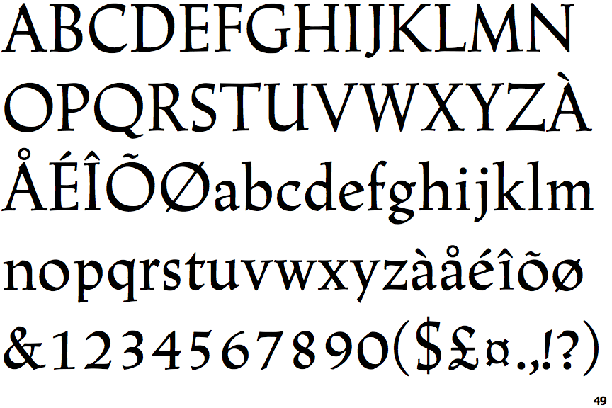
The verticals of the upper-case 'M' are sloping.
|
 |
The upper-case 'U' has a stem/serif.
|
 |
The upper-case 'G' foot has no spur or serif.
|
 |
The centre bar of the upper-case 'R' meets the vertical.
|
 |
The foot of the '4' has double-sided serifs.
|
 |
The lower-case 'e' has a straight angled bar.
|
 |
The top vertices of the upper-case 'M' have no top serifs.
|
 |
The foot of the '£' (pound) has a loop.
|
Note that the fonts in the icons shown above represent general examples, not necessarily the two fonts chosen for comparison.
Show Examples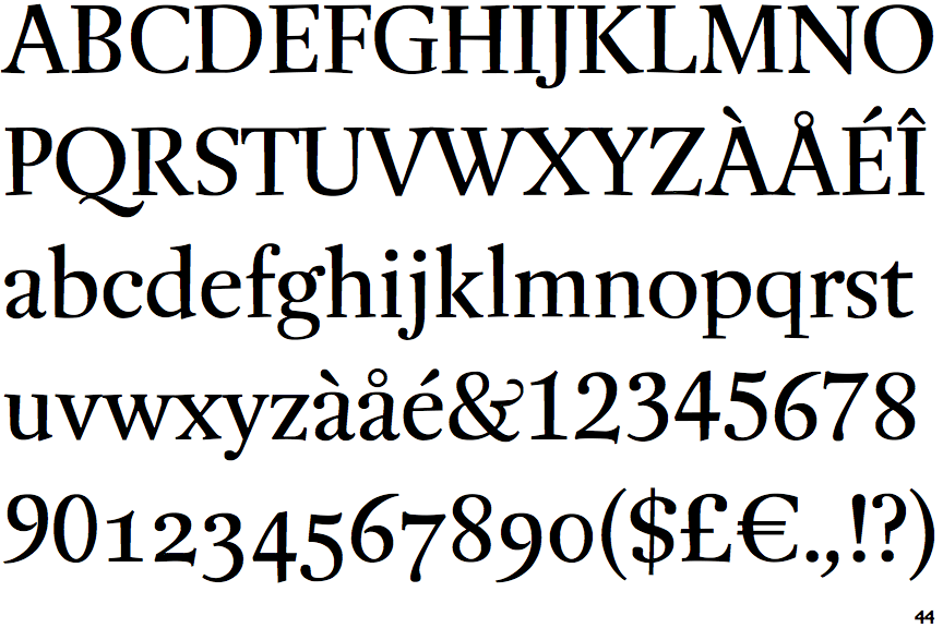
 |
The verticals of the upper-case 'M' are parallel.
|
 |
The upper-case 'U' has no stem/serif.
|
 |
The upper-case 'G' foot has a forward pointing spur or serif.
|
 |
The centre bar of the upper-case 'R' leaves a gap with the vertical.
|
 |
The foot of the '4' has no serifs.
|
 |
The lower-case 'e' has a straight horizontal bar.
|
 |
The top vertices of the upper-case 'M' have symmetrical single-sided serifs.
|
 |
The foot of the '£' (pound) has no loop.
|