 |
The upper-case 'Q' tail crosses the circle.
|
 |
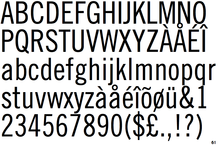
The '&' (ampersand) is traditional style with two enclosed loops.
|
 |
The lower-case 'g' is double-storey (with or without gap).
|
 |
The '1' (digit one) has double-sided base or serifs.
|
 |
The upper-case letter 'I' is plain.
|
 |
The stem of the '7' is straight.
|
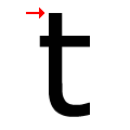 |
The top of the lower-case 't' ascender is flat.
|
Note that the fonts in the icons shown above represent general examples, not necessarily the two fonts chosen for comparison.
Show Examples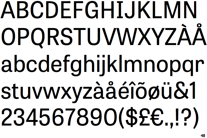
 |
The upper-case 'Q' tail touches the circle.
|
 |
The '&' (ampersand) is traditional style with a gap at the top.
|
 |
The lower-case 'g' is single-storey (with or without loop).
|
 |
The '1' (digit one) has no base.
|
 |
The upper-case letter 'I' has serifs/bars.
|
 |
The stem of the '7' is curved inwards.
|
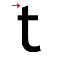 |
The top of the lower-case 't' ascender is angled upwards.
|