Identifont

Fonts by Appearance

Fonts by Name

Fonts by Similarity

Fonts by Picture

Fonts by Designer/Publisher

Differences

TweetTweet Differences

Compare: and  

Trackpad

Trackpad

Closed
The '4' is closed.
Round
The top storey of the '3' is a smooth curve.
Meets
The centre bar of the upper-case 'P' meets the vertical.
1-Storey
The lower-case 'a' stem stops at the top of the bowl (single storey).
Left
The upper-case 'G' has a bar to the left.

Note that the fonts in the icons shown above represent general examples, not necessarily the two fonts chosen for comparison.

Show Examples
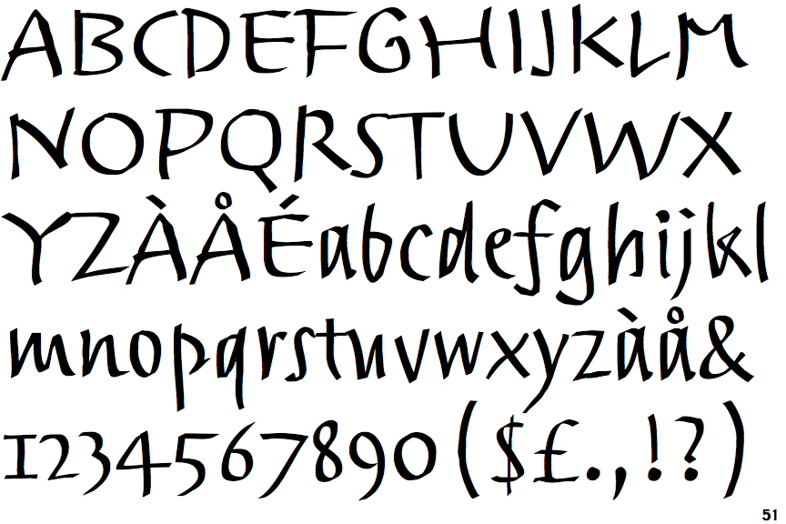
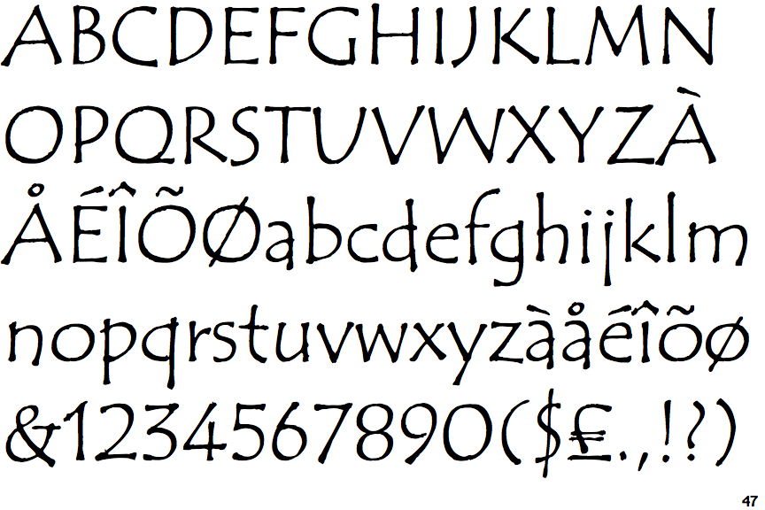
ITC Tempus Sans

ITC Tempus Sans

Open
The '4' is open.
Angled
The top storey of the '3' is a sharp angle.
Crosses
The centre bar of the upper-case 'P' crosses the vertical.
2-Storey
The lower-case 'a' stem curves over the top of the bowl (double storey).
No bar
The upper-case 'G' has no bar.