Differences
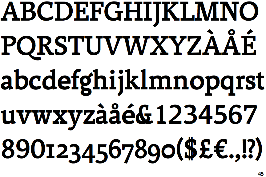
Tow Bold
 |
The '$' (dollar) has a double line crossing the 'S'.
|
 |
The '&' (ampersand) is traditional style with a gap at the top.
|
 |
The '4' is closed.
|
 |
The centre vertex of the upper-case 'M' is on the baseline.
|
 |
The centre bar of the upper-case 'E' has serifs.
|
 |
The upper-case 'G' foot has a downward pointing spur.
|
 |
The centre vertex of the upper-case 'W' has two separate serifs.
|
 |
The bar of the upper-case 'G' is double-sided.
|
 |
The feet of the lower-case 'h' have two serifs on each foot.
|
 |
The centre bar of the upper-case 'F' has serifs.
|
There are more than ten differences; only the first ten are shown.
Note that the fonts in the icons shown above represent general examples, not necessarily the two fonts chosen for comparison.
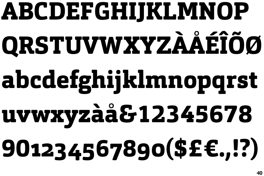
Show ExamplesOrgon Slab Extra Bold
 |
The '$' (dollar) has a single line crossing the 'S'.
|
 |
The '&' (ampersand) looks like 'Et' with a gap at the top.
|
 |
The '4' is open.
|
 |
The centre vertex of the upper-case 'M' is above the baseline.
|
 |
The centre bar of the upper-case 'E' has no serifs.
|
 |
The upper-case 'G' foot has no spur or serif.
|
 |
The centre vertex of the upper-case 'W' has no serifs.
|
 |
The bar of the upper-case 'G' is single-sided, left-facing.
|
 |
The feet of the lower-case 'h' have two serifs on the left and one on the right.
|
 |
The centre bar of the upper-case 'F' has no serifs.
|

