 |
The '&' (ampersand) looks like 'Et' with a gap at the top.
|
 |
The '4' is open.
|
 |
The centre bar of the upper-case 'P' meets the vertical.
|
 |
The lower-case 'a' stem curves over the top of the bowl (double storey).
|
 |
The upper-case 'Y' arms and tail are separate strokes.
|
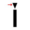 |
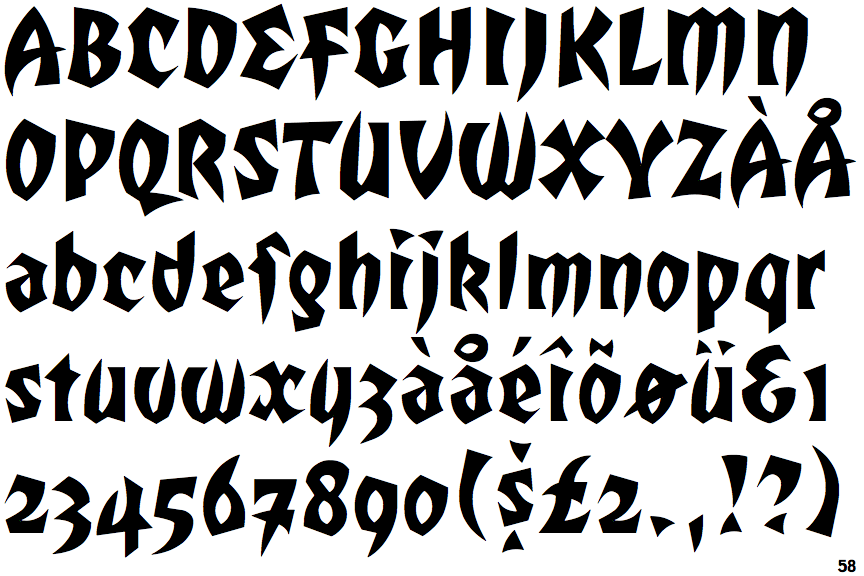
The dot on the lower-case 'i' or 'j' is triangular.
|
 |
The '7' has a bar.
|
 |
The characters are plain.
|
Note that the fonts in the icons shown above represent general examples, not necessarily the two fonts chosen for comparison.
Show Examples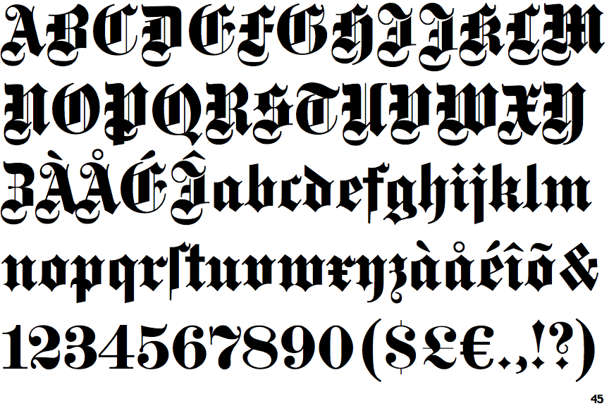
 |
The '&' (ampersand) is traditional style with two enclosed loops.
|
 |
The '4' is closed.
|
 |
The centre bar of the upper-case 'P' crosses the vertical.
|
 |
The lower-case 'a' stem stops at the top of the bowl (single storey).
|
 |
The upper-case 'Y' right-hand arm forms a continuous stroke with the tail.
|
 |
The dot on the lower-case 'i' or 'j' is diamond-shaped.
|
 |
The '7' has no bar.
|
 |
The characters are blackletter.
|