Identifont

Fonts by Appearance

Fonts by Name

Fonts by Similarity

Fonts by Picture

Fonts by Designer/Publisher

Differences

TweetTweet Differences

Compare: and  

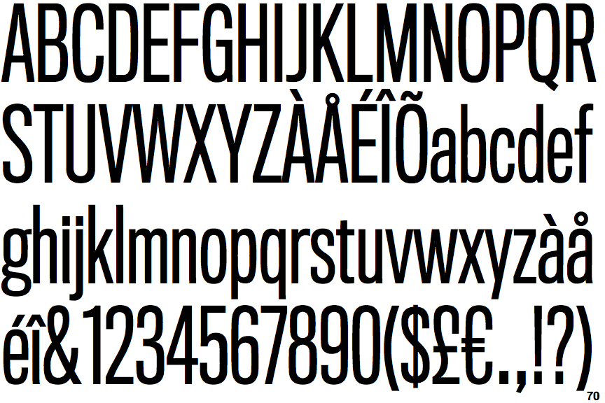
Titling Gothic Compressed

Titling Gothic Compressed

Touches
The upper-case 'Q' tail touches the circle.
Straight
The tail of the lower-case 'y' is substantially straight.

Note that the fonts in the icons shown above represent general examples, not necessarily the two fonts chosen for comparison.

Show Examples
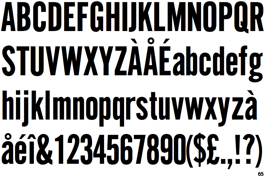
CG Gothic No. 1

CG Gothic No. 1

Crosses
The upper-case 'Q' tail crosses the circle.
Left
The tail of the lower-case 'y' is curved or U-shaped to the left.