 |
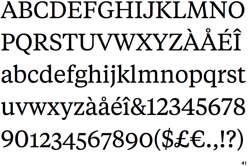
The verticals of the upper-case 'M' are sloping.
|
 |
The top of the upper-case 'A' has a serif or cusp on the left.
|
 |
The top stroke of the upper-case 'C' has no upward-pointing serif.
|
 |
The upper-case 'C' is symmetrical about a horizontal axis.
|
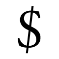 |
The line of the '$' (dollar) is slanted.
|
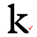 |
The leg of the lower-case 'k' has straight leg with no serif or foot.
|
Note that the fonts in the icons shown above represent general examples, not necessarily the two fonts chosen for comparison.
Show Examples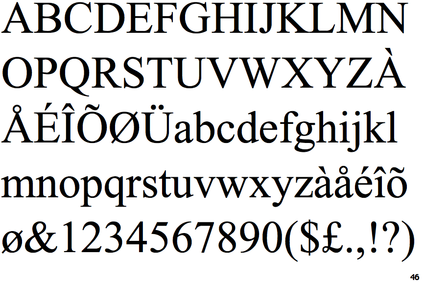
 |
The verticals of the upper-case 'M' are parallel.
|
 |
The top of the upper-case 'A' has no serifs or cusps.
|
 |
The top stroke of the upper-case 'C' has a vertical or angled upward-pointing serif.
|
 |
The upper-case 'C' is asymmetrical about a horizontal axis.
|
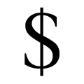 |
The line of the '$' (dollar) is vertical.
|
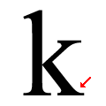 |
The leg of the lower-case 'k' has two lower serifs.
|