 |
The upper-case 'J' sits on the baseline.
|
 |
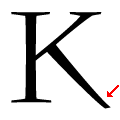
The diagonal strokes of the upper-case 'K' meet at the vertical (with or without a gap).
|
 |
The centre bar of the upper-case 'P' meets the vertical.
|
 |
The tail of the upper-case 'J' has a rounded end or ball.
|
 |
The dot on the lower-case 'i' or 'j' is circular or oval.
|
 |
The feet of the lower-case 'h' have two serifs on each foot.
|
 |
The leg of the upper-case 'K' has two serifs.
|
 |
The stroke of the lower-case 'c' has a rounded end or ball.
|
 |
The top vertices of the upper-case 'M' have symmetrical single-sided serifs.
|
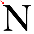 |
The top-left vertex of the upper-case 'N' has one serif.
|
Note that the fonts in the icons shown above represent general examples, not necessarily the two fonts chosen for comparison.
Show Examples
 |
The upper-case 'J' descends below the baseline.
|
 |
The diagonal strokes of the upper-case 'K' meet in a 'T'.
|
 |
The centre bar of the upper-case 'P' leaves a gap with the vertical.
|
 |
The tail of the upper-case 'J' has a tapered end.
|
 |
The dot on the lower-case 'i' or 'j' is diamond-shaped.
|
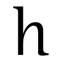 |
The feet of the lower-case 'h' have no serifs on the left and one on the right.
|
 |
The leg of the upper-case 'K' has no serif or foot.
|
 |
The stroke of the lower-case 'c' has a flat end or downward-pointing serif.
|
 |
The top vertices of the upper-case 'M' have no top serifs.
|
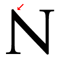 |
The top-left vertex of the upper-case 'N' has no serifs.
|