 |
The '4' is closed.
|
 |
The diagonal strokes of the upper-case 'K' meet in a 'T'.
|
 |
The verticals of the upper-case 'M' are parallel.
|
 |
The top storey of the '3' is a smooth curve.
|
 |
The 'l' (lower-case 'L') has no serifs or tail.
|
 |
The upper-case 'J' has no bar.
|
 |
The sides of the lower-case 'y' are angled (V-shaped).
|
 |
The tail of the lower-case 'y' is substantially straight.
|
 |
The lower-case 'u' has a stem/serif.
|
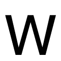 |
The centre vertex of the upper-case 'W' is level with the outer strokes.
|
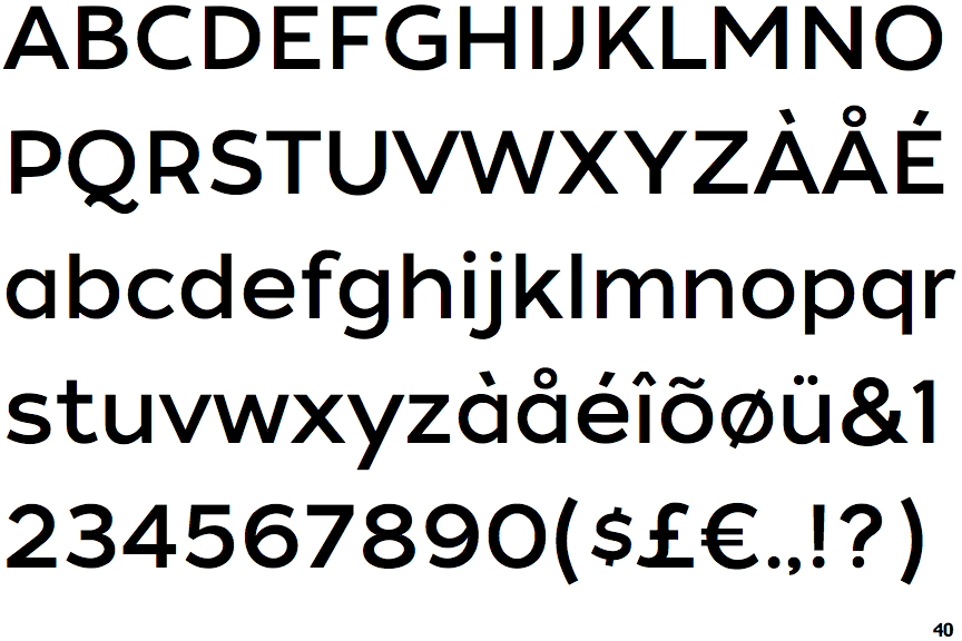
Note that the fonts in the icons shown above represent general examples, not necessarily the two fonts chosen for comparison.
Show Examples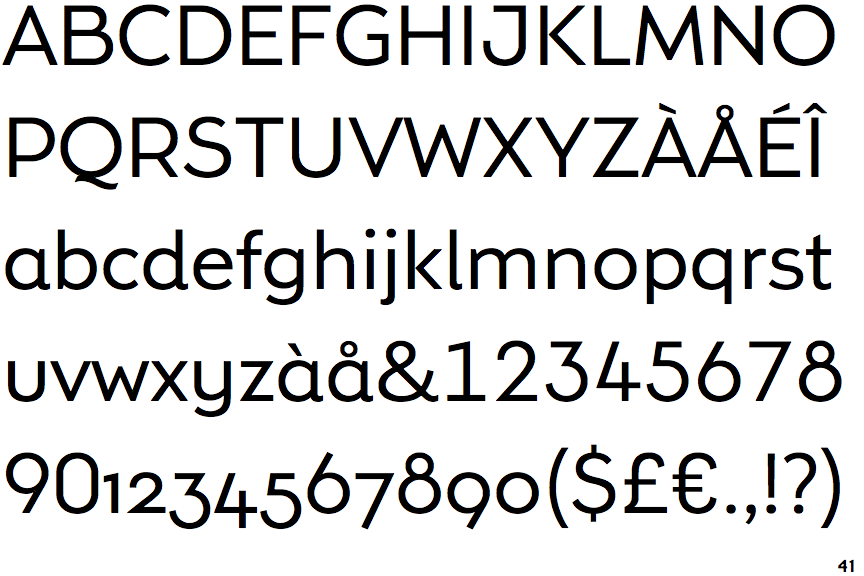
 |
The '4' is open.
|
 |
The diagonal strokes of the upper-case 'K' meet at the vertical (with or without a gap).
|
 |
The verticals of the upper-case 'M' are sloping.
|
 |
The top storey of the '3' is a sharp angle.
|
 |
The 'l' (lower-case 'L') has a right-facing lower serif or tail.
|
 |
The upper-case 'J' has a bar to the left.
|
 |
The sides of the lower-case 'y' are parallel (U-shaped).
|
 |
The tail of the lower-case 'y' is curved or U-shaped to the left.
|
 |
The lower-case 'u' has no stem/serif.
|
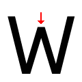 |
The centre vertex of the upper-case 'W' is below the outer strokes.
|